Three projects, one outcome.
Three Danone briefs: public web, pharmacy ops, and nursing referral. Each had its own users, its own research method, and its own hard call to make. I owned framing → V1 design across all three; build sat with internal engineering after handoff.
- Adult Ecosystem. 4 of 7 friction points scoped into V1.0 IA, with a "not now" list the team had never had before.
- Home Pharmacy. 5 workflows mapped from on-site research → 3 automated in V1, 2 explicitly held manual.
- Nursing Referral. Co-designed with 5 nurses, tested with 6 post-launch. 5/6 completed without help. Ops "did it go through?" calls down ~18% month one.
Below: each project on its own terms.
Three separate briefs, three different users, one patient moving through all of them.
I joined Nutricia to lead three distinct design projects: a public web restructure, an internal home pharmacy tool, and a nursing referral form. Different stakeholders commissioned each one. Different users lived inside each one. But the same adult cancer patient would eventually touch all three, and nobody was designing for that continuity.
I treated each project on its own terms, with its own problem, research method, and users, while keeping the same patient visible across the three. Each project below stands on its own: problem, research, design, outcome. The continuity sits at the top.
Scope of my ownership: across all three projects I owned problem framing, primary research, workflow definition, and V1 design through stakeholder sign-off. Engineering build and long-term rollout sat with internal Nutricia / Danone teams and their delivery partners after handoff. I call that boundary out explicitly in each project below.
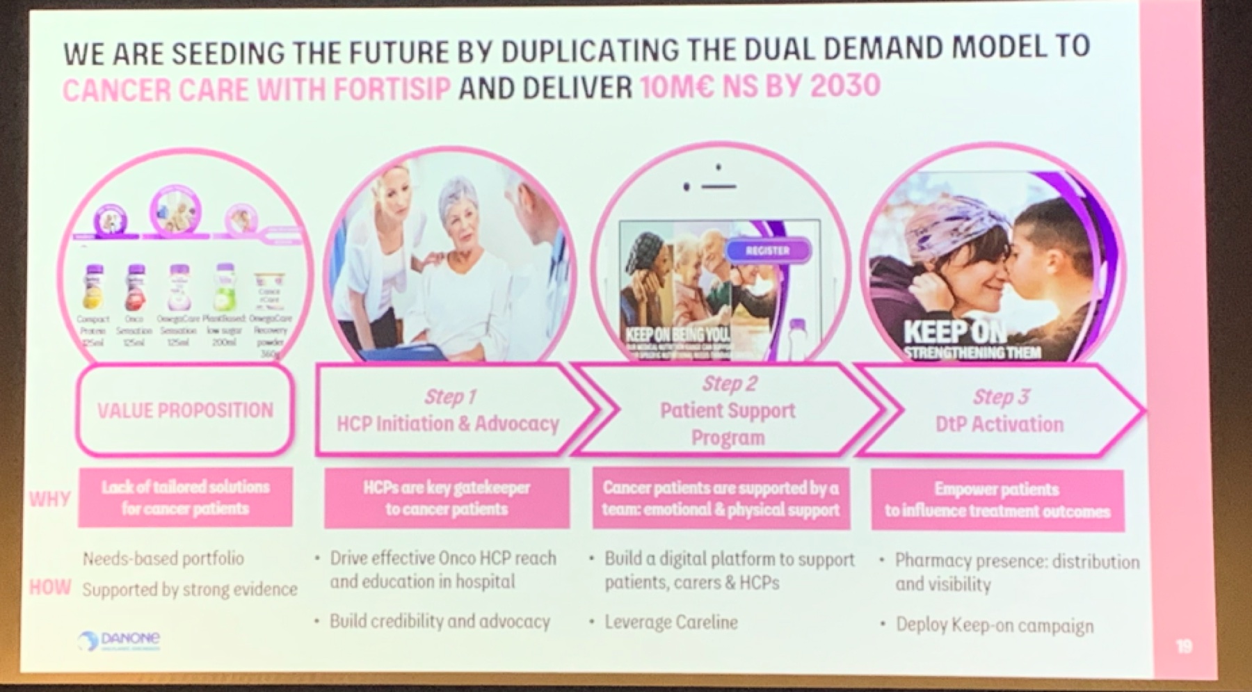
Business context: replicate the Fortisip dual-demand model for cancer care. The work below is upstream of that target.
Three projects, three research methods, three user groups
The three projects ran on different tracks with different collaborators. What follows is each one on its own: the problem I framed, the method I chose because of who the users were, what the research surfaced, the design, and the impact.
Adult Ecosystem
Users: adult cancer patients, carers, HCPs
Research: multi-brand stakeholder workshops, audit, prioritisation
Problem: fragmented pages across brand sites, no path from a cancer-aware search query to a product consideration.
Home Pharmacy (NAHP)
Users: pharmacists, HCPs, patients on home delivery
Research: contextual inquiry on-site, recurring pharmacist meetings, Danone workshops
Problem: five concurrent workflows stitched together with spreadsheets, Text Magic, and manual charging, with no unified tool.
Nursing Referral
Users: oncology and community nurses
Research: nurse co-design workshops, post-release usability testing
Problem: long single-page intake form nurses abandoned mid-way, no confirmation loop, no mobile.
Adult Cancer Care: public ecosystem restructure
Cancer patients, carers, and HCPs looking for adult nutrition support landed on a patchwork of category pages, some on Nutricia.com.au, some on HCP Hub, and some on legacy brand sites. None of them told a connected story, and the content double-wrote for two audiences at once.
No path from a cancer-aware search query to a considered product choice
The existing pages were built at different times, by different brand teams, for different audiences. A patient Googling "nutrition after chemo" could land on three different journeys depending on entry point. HCPs saw the same pages as patients, sized for neither. Each Danone oncology and nutrition brand team wanted different things surfaced, and those conflicts had never been resolved at the system level.
This is a multi-brand alignment problem, not a page redesign
If the underlying disagreement was "which brand team owns which part of the patient journey," designing another set of pages would just harden the problem. I reframed the brief as an IA alignment exercise with the brand teams as co-owners, and made that reframing the first thing I validated with stakeholders.
Stakeholder workshops across Danone's multi-brand teams
I ran three rounds of working sessions with four Danone brand and ops teams across the adult nutrition portfolio. Each session had two parts: (1) an audit of how the current ecosystem was failing patients/HCPs from their brand's perspective, and (2) a prioritisation exercise. Which friction points were load-bearing for the dual-demand business model, and which were secondary?
The workshop output wasn't consensus for its own sake. It was a ranked list of ecosystem-level problems I could defend back to each team with their own words. That list became the design brief.
The ecosystem, not the pages, was the problem
Putting every current touchpoint on one canvas made the fragmentation impossible to argue with. The same patient could hit three different journeys across HCP Hub, brand sites, and Nutricia.com.au, each with different gating and different content.
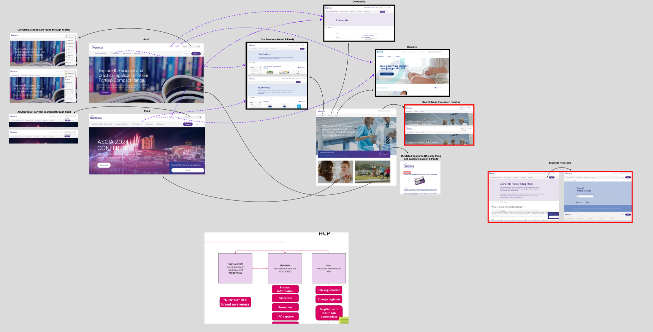
Current-state audit shared with brand teams in workshop: fragmented touchpoints across HCP Hub, brand sites, and Nutricia.com.au.
Seven friction points, ranked with the brand teams
From the workshops I distilled seven ecosystem-level problems: fragmented oncology info, unclear path to purchase, inconsistent HCP guidance, weak scientific evidence placement, missing tube-feeding support, global vs local content mismatch, and no one-stop entry. I paired each one with an action the brand teams had co-signed.
This turned a qualitative audit into a prioritised backlog the team could argue about and commit to.
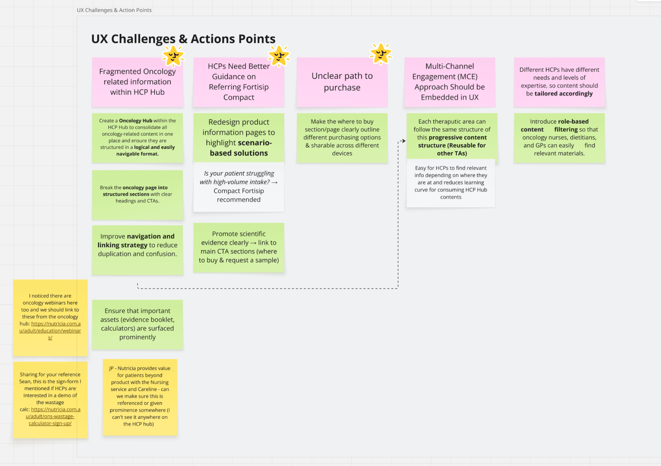
Seven UX challenges, each paired with an action.
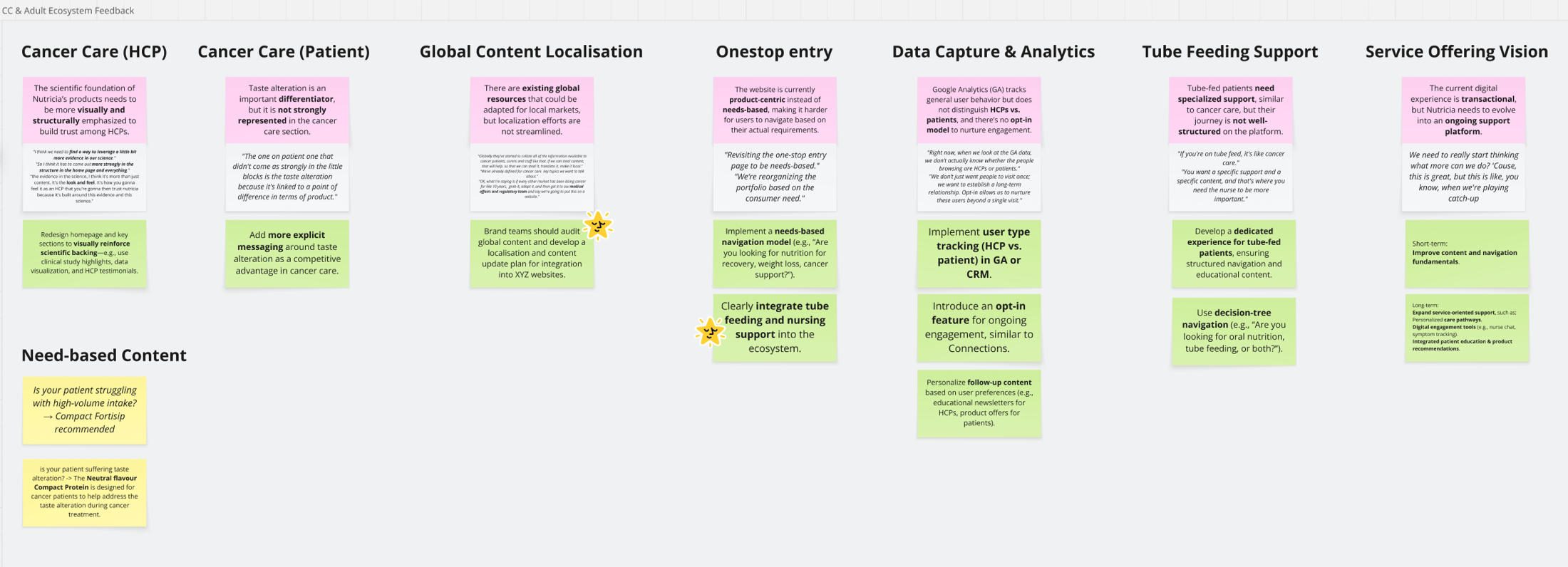
Ecosystem-level feedback matrix co-built with brand teams: HCP vs patient content, global localisation, one-stop entry, tube-feeding support, service-offering vision.
Role gate, three-sitemap canvas, service-led architecture, V1.0 template
Four design moves, each traceable back to a workshop finding: a role gate at entry so HCPs and patients stop sharing pages, a current → V1.0 → future sitemap on a single canvas so stakeholders could see the bet, a service flow so product/content/CRM teams had a shared model, and a V1.0 template implementable across every Nutricia brand site.
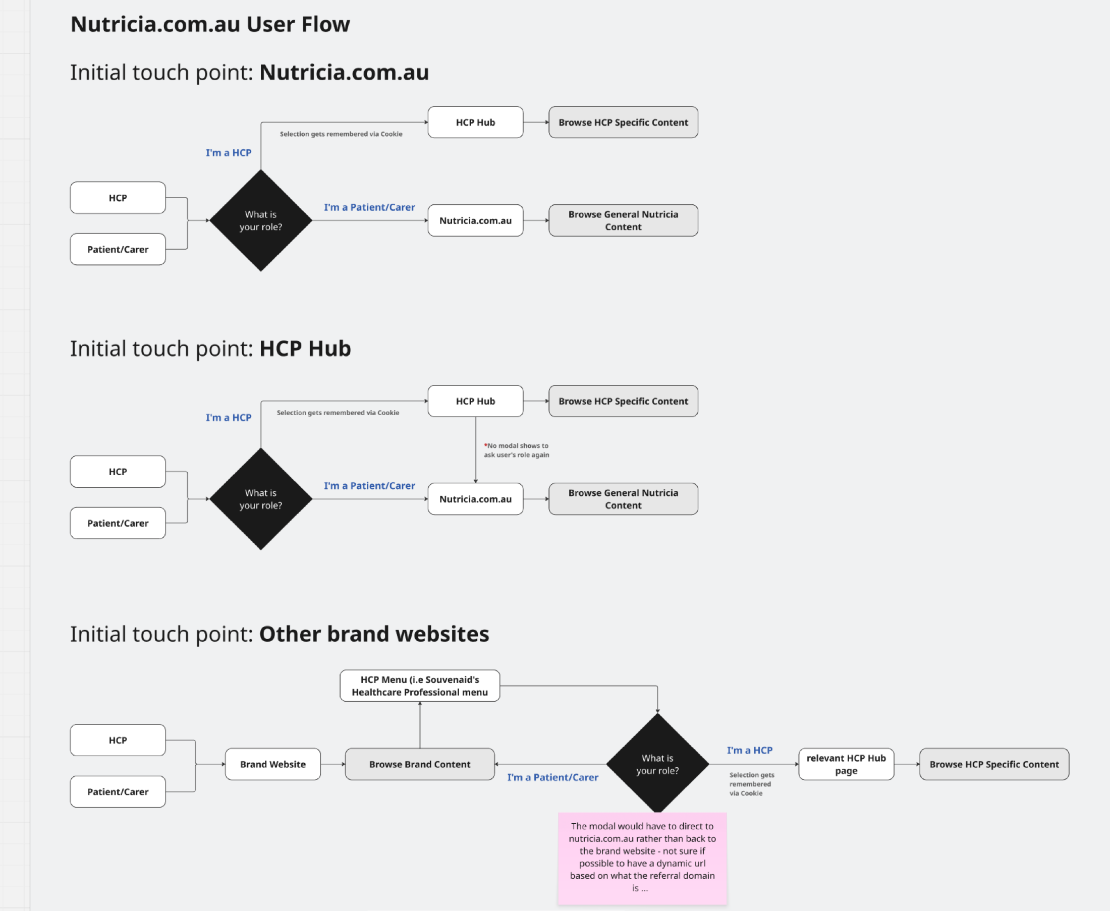
Three initial touch-points, each with a different gating logic. All funnel to the right content for the right role.
Role gate before content, not after
HCPs and patients need different information but share entry points. I modelled three touch-point flows and made the "Are you HCP or patient/carer?" decision explicit at entry, not buried inside pages.
That freed downstream content from double-writing for two audiences, a recurring source of scope bloat the brand teams had flagged in every workshop.
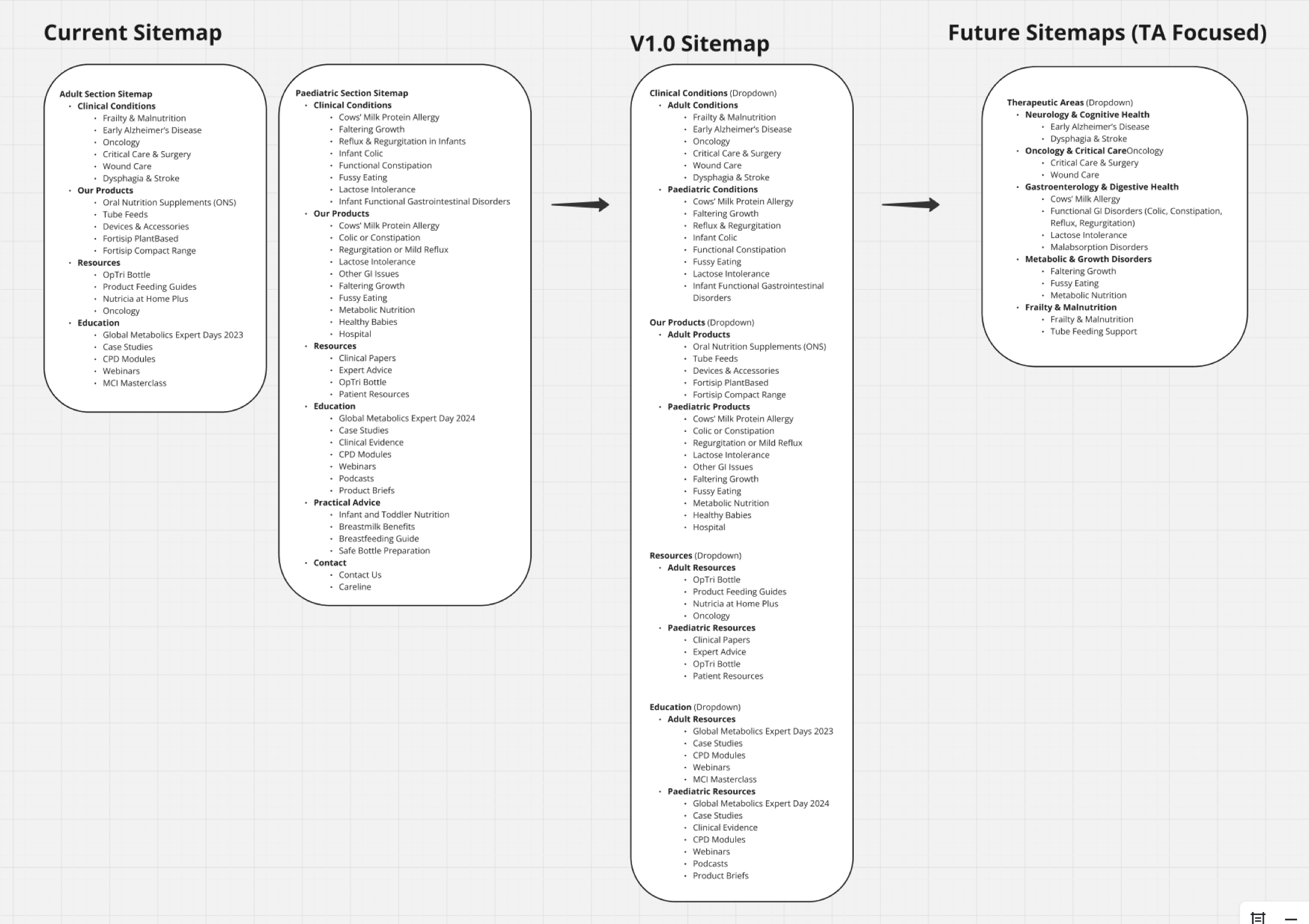
Current → V1.0 → Future on one canvas. V1.0 was defensible as "the smallest restructure that unlocks the dual-demand model," with the future state showing where other therapeutic areas could extend.
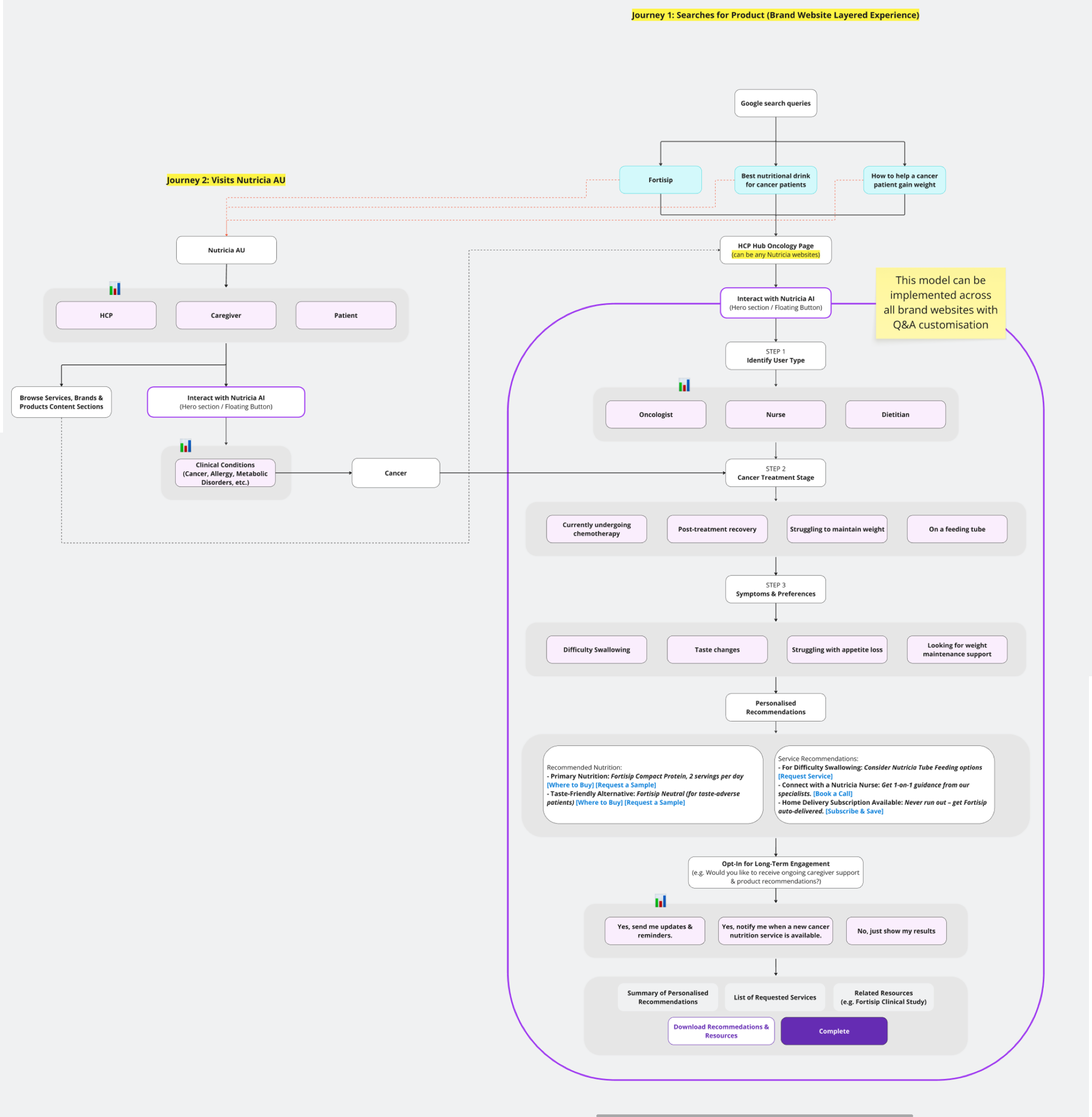
Service-led architecture: from a Google search query through treatment type, symptoms, personalised recommendations, and long-term engagement. The flow, not any single screen, is the product.
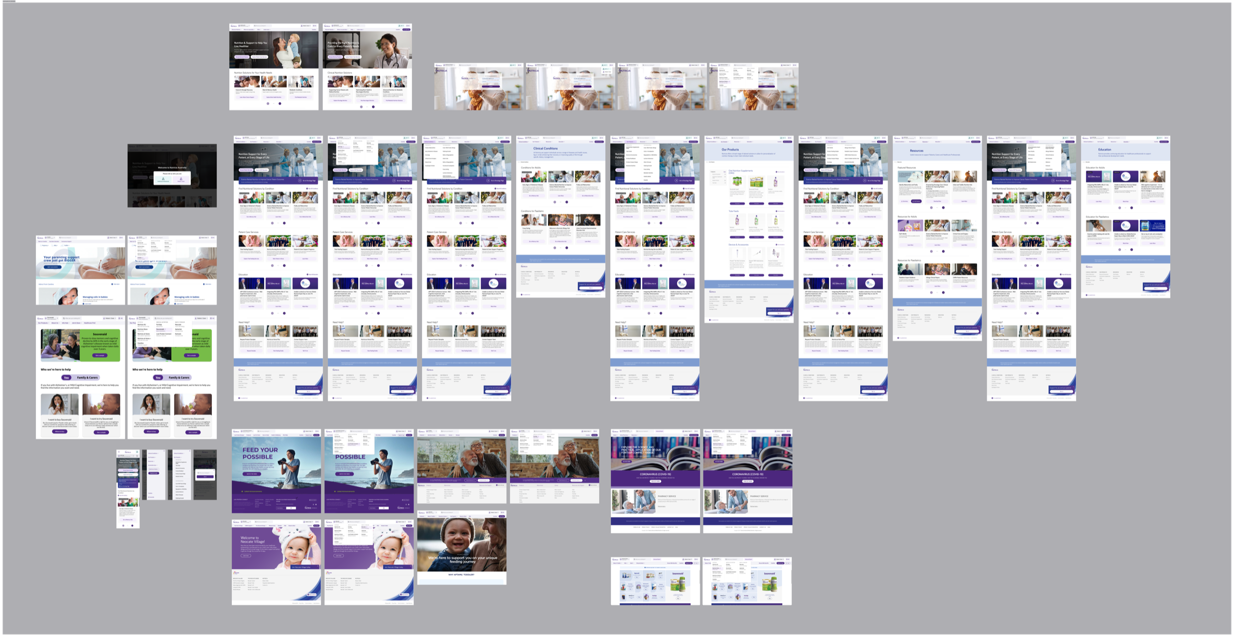
V1.0 design output: the full page set translating the service flow into a reusable template with an HCP / patient switcher.
I turned cross-brand disagreement into an approved V1.0 IA: separate HCP and patient entry, a minimum-viable oncology journey, and a reusable therapeutic-area template. Four of the seven friction points I surfaced were approved into V1.0 scope; three were explicitly deferred to later phases. It was the first time this team had a published "not now" list instead of an open backlog.
4 of 7 friction points scoped
Workshop-ranked list became the V1.0 brief. HCP/patient role split, oncology landing, evidence placement, and service flow shipped into scope; three were deferred with rationale recorded.
Reusable template, not a one-off site
The V1.0 template became the reference IA the brand team carried into subsequent therapeutic-area planning after my handoff.
My handoff boundary
I owned the workshops, IA, service flow, and V1.0 design through sign-off. Build and publication moved to the brand team's delivery partner after handoff.
Scope vs. scalability. I argued for the reusable template over an oncology-only site, accepting extra upfront design time so future therapeutic areas would not restart from zero. The brand leads agreed after the sitemap-on-one-canvas session made the alternative visible.
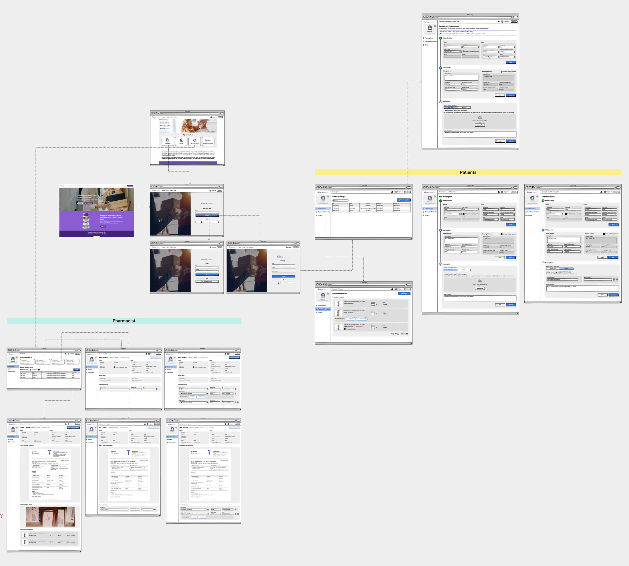
Home Pharmacy (NAHP): pharmacist operations tool
Home delivery of medical nutrition depends on a handful of pharmacists juggling five concurrent workflows, dispense, patient list, messaging, reminders, and charging, with spreadsheets and third-party tools. I was asked to design the digital tool that would pull this together. My first decision was not to design anything yet.
Scope of my ownership: discovery, service blueprint, V1 LOFI, and the scoped V1 metrics. Engineering took the build forward after handoff. The case study below ends where the engineering scope began, because that is where my direct ownership ended.
Nobody had actually written down what pharmacists do in a week
The pharmacist side was a set of manual workarounds: weekly patient call-ups, Text Magic and MedAdvisor reminders, manual charging for stock issues, and four different order types each with their own rules. None of this was documented. The risk was clear: a tool built from assumptions would automate the wrong workflow, get adopted for a week, and get abandoned.
Understand reality on the pharmacist's floor before anything hits a wireframe
I pushed back on the "ship a dashboard" brief. The team didn't know enough yet. LOFI for as long as it took, real pharmacist time before pixel time, and the service blueprint as the single artefact everyone, from Danone brand to engineering to pharmacists, could argue against.
Contextual inquiry at the pharmacy, plus recurring pharmacist meetings and Danone workshops
I ran contextual inquiry on the pharmacy floor, observing dispense cycles end-to-end, not interviews in a meeting room.
Over eight weeks I ran three research threads in parallel: (1) two full-day on-site contextual inquiry sessions at the pharmacy, shadowing the pharmacist through full dispense cycles, (2) six recurring follow-up meetings with the pharmacist team to validate observations and catch edge cases I'd missed, and (3) two Danone workshops with the brand and ops leads to translate pharmacy reality into design decisions they could back.
The three-thread setup was deliberate. Pharmacists know the work. Danone owns the business rules. Neither alone produces a working tool.
One pharmacist, five concurrent processes, each with its own tool and its own failure mode
A day on site with the pharmacist team at Gavin Starr Pharmacy mapped the full week: dispense, patient-list updates, Text Magic, MedAdvisor reminders, and charging. Each had its own tools, own cadence, and own failure modes. The notes weren't artefacts. They became the filter that decided what the product should and shouldn't automate.
Field notes turned into design constraints
Sticky-note walls captured what no documentation contained: weekly call-up cadence, payment friction, stock-issue charging policy, how exceptions actually get resolved.
Follow-up pharmacist meetings then stress-tested the map against "what about this edge case" until nothing new came up.
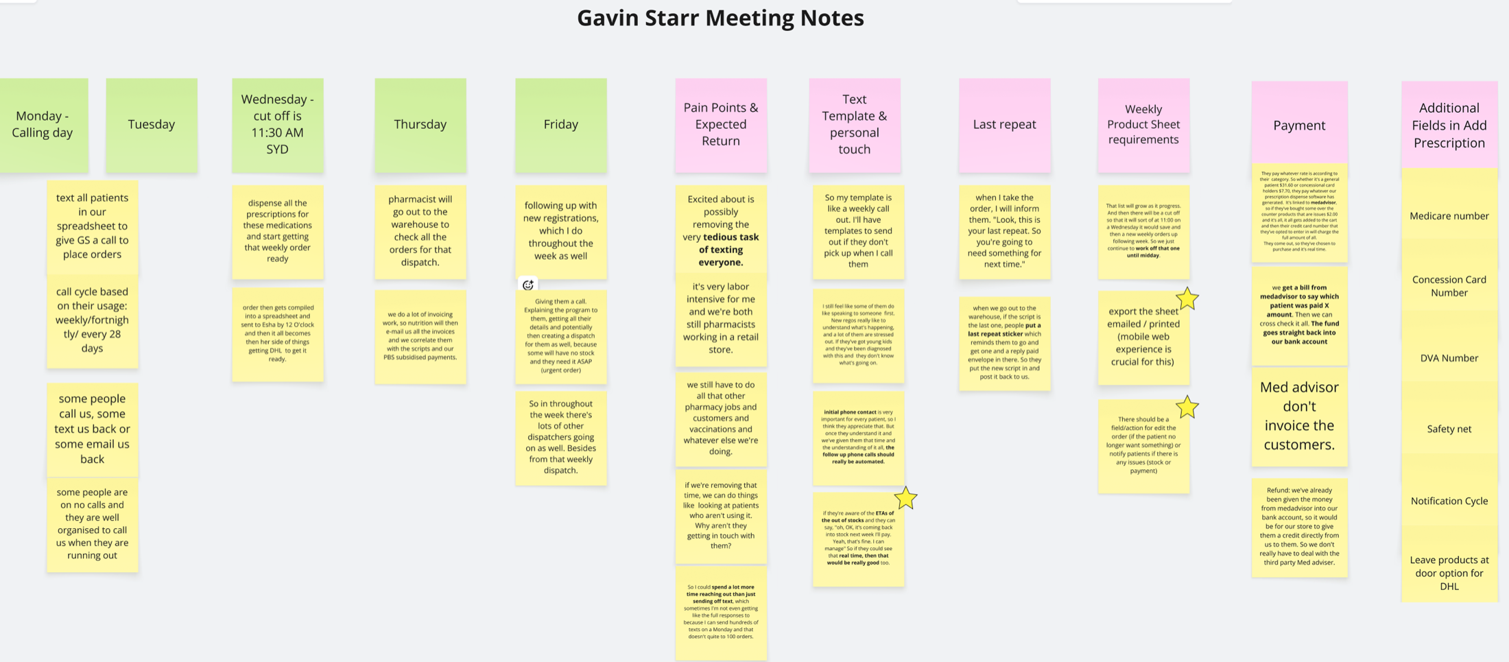
Recurring pharmacist meeting notes: cadence, payment friction, stock-issue charging policy.
Contextual inquiry output: five concurrent processes observed in one day. Highest-friction points were visible at a glance. That became the foundation for every downstream decision.
Between the second on-site visit and the LOFI, I used AI to stress-test my workflow map against comparable pharmacy ops models from outside Australia. Not to copy their patterns, but to see which of mine were assumptions vs observations. Two assumptions surfaced: I'd treated "urgent" and "eScript" as parallel paths when on the floor they actually share a queue. That correction went into the service blueprint before Danone saw V1.
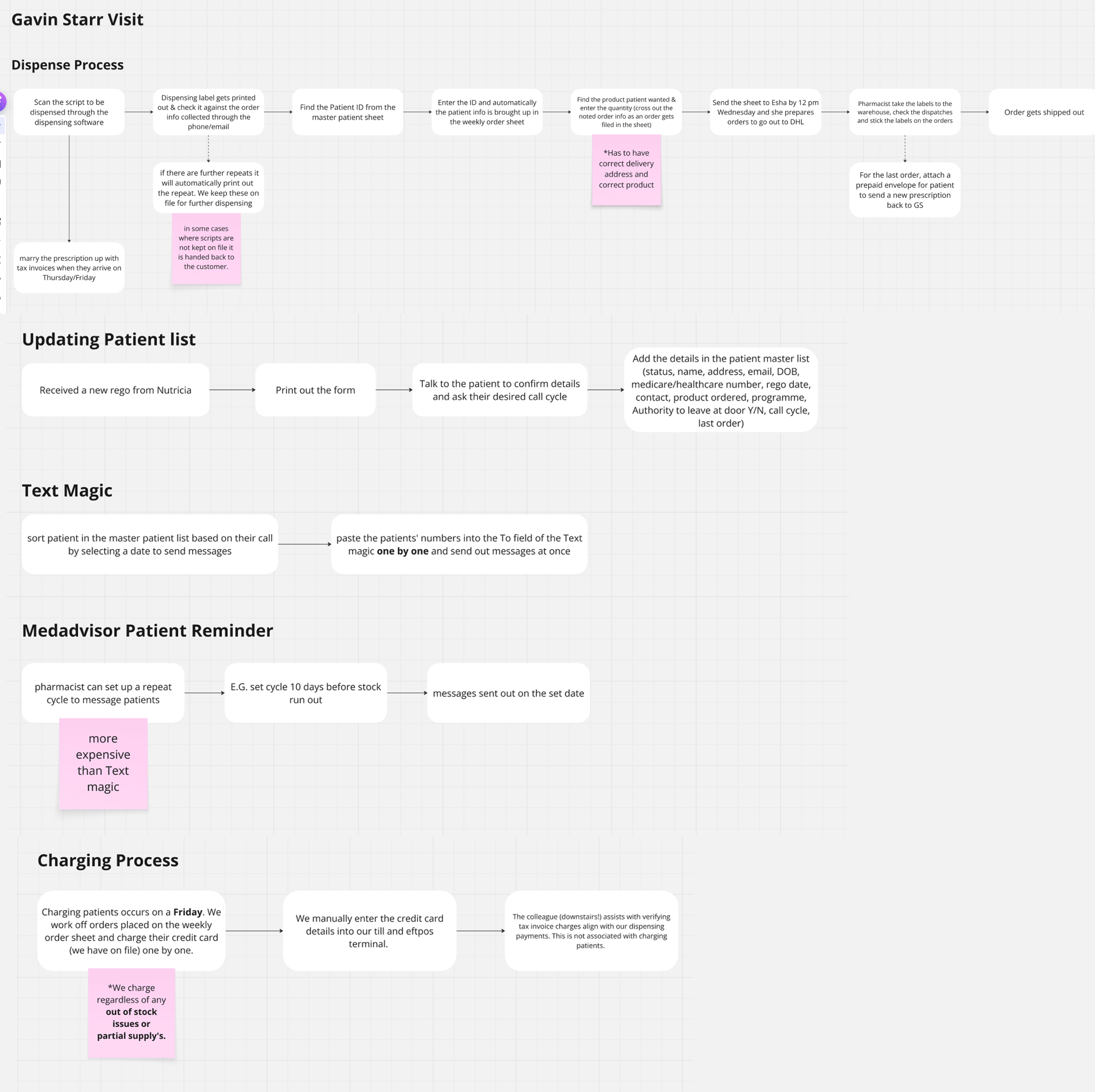
Service blueprint first, then a LOFI dashboard pointed at the right three numbers
Urgent, Hard Copy, Home Pharmacy, and eScript prescriptions each move through different hands and different rules. The blueprint showed where each branch broke today. From there, the dashboard design fell out: Patients, Outstanding Patients, Outstanding Regimens. Three numbers that tell the pharmacist what needs doing today. Everything else is a click away.
Service blueprint co-built with the pharmacist team and reviewed in Danone workshops. Decision diamonds mark where errors, delays, and manual exceptions currently live.
Dashboard pointed at three numbers, not twenty
The pharmacist opens the tool to see what needs doing today, not to browse. Research had already made this decision for me; I just had to make the UI stop hiding it.
This let engineering scope v1 with confidence: the three-metric dashboard and the order tracker first, everything else deferred.
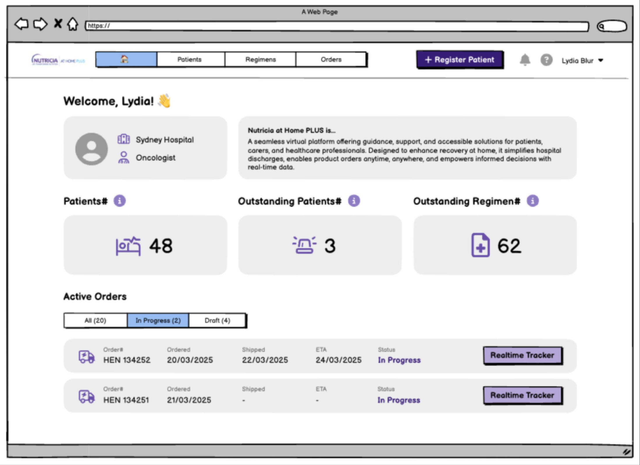
Dashboard LOFI: three metrics, real-time order tracker, register-patient CTA.
Pharmacist-side and patient-side screens across the full dispense cycle. LOFI on purpose: shape first, pixels later.
I replaced an unscoped "build everything" brief with a V1 anchored on evidence: three of the five pharmacist workflows selected for automation in V1 scope; two held as manual by explicit decision, with the reasons recorded in the blueprint. The engineering team picked the project up with a defensible boundary instead of an open backlog.
5 workflows mapped, 3 automated
Dispense, patient-list updates, and reminders went into V1 scope. Text Magic routing and stock-issue charging were explicitly left manual. Automating them would have hidden pharmacist judgement the service depends on.
Dashboard narrowed to 3 metrics
Patients, Outstanding Patients, Outstanding Regimens. This cut the v1 build surface from a multi-screen suite to a single dashboard + order tracker, which is what engineering committed to after my handoff.
My handoff boundary
I owned discovery, blueprint, LOFI, and the scope negotiation through to the engineering commitment. Post-handoff build, rollout, and pharmacist adoption sat with the engineering and ops teams.
Operational accuracy vs. usability. I pushed to mirror the real pharmacist workflow (accurate but messy) over a cleaner digital model (usable but wrong). The two-week LOFI extension was mine to defend in the Danone workshop. The alternative was a tool pharmacists would stop opening after the first dispense cycle because it didn't match reality.
Nursing Referral Form: clinical intake, co-designed with nurses
The form is where a patient actually becomes a patient. An oncology or community nurse sees a case that needs nutrition support, fills out a referral, and Nutricia takes over from there. If the nurse abandons the form, the patient never enters the care system. Everything downstream, pharmacy, product, and service, depends on this single submission working.
A clinical form designed like a marketing form
The existing form was a long single page with no section grouping, no confirmation email, and no mobile layout. Nurses who fill referrals between patients, often on a phone and often interrupted, abandoned it mid-way, and the ops team fielded "did my referral go through?" calls the rest of the week. The friction wasn't cosmetic. It was stopping patients from entering the system.
Design with nurses, not for them
Clinical users have strong opinions about what belongs on a referral form, and getting those opinions second-hand through Danone would have produced the same kind of form we were replacing. I framed the work as a co-design engagement with practising nurses, where their choices on section order, field wording, and required-vs-optional shaped the design, then validated the live form in post-launch usability testing with practising nurses.
Co-design workshops + post-release usability testing with practising nurses
I worked with the oncology and community nurses Danone already had clinical relationships with. The engagement had two phases: (1) three co-design workshops with five practising nurses who shaped section grouping, field order, required-vs-optional, and the confirmation loop from the inside, and (2) post-launch usability testing with six nurses against the live V1.0 to capture what only real submissions could teach.
Working with the nurses who'd actually be submitting referrals meant the form reflected how clinical users think, not how a brand team thinks clinical users think.
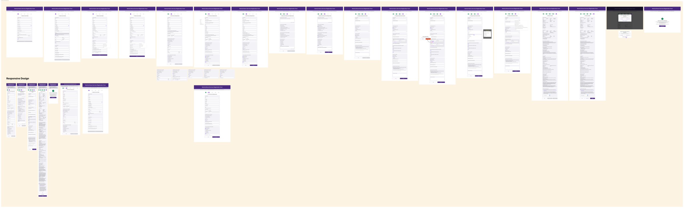
Staged responsive form, confirmation-email loop, V1.1 spec from real feedback
Three design decisions fell directly out of the nurse workshops: sectioned groups so the form can be filled in order under interruption, a responsive layout sized for a phone between patients, and a confirmation email that closes the loop, because a nurse who doesn't know a referral went through resubmits.
V1.0 iteration wall: section grouping, validation states, and responsive behaviour across desktop, tablet, and mobile, with each decision traceable to a nurse workshop.
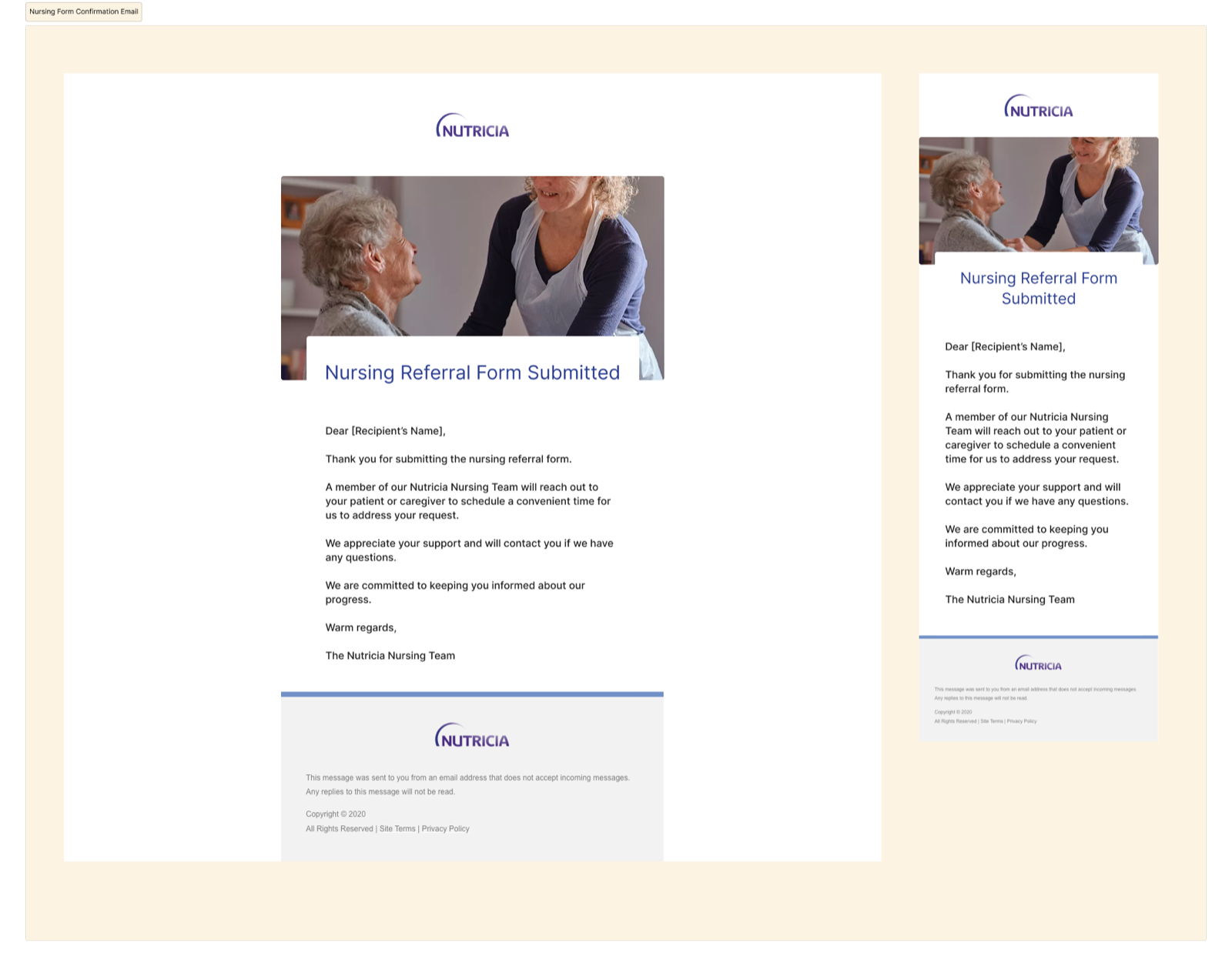
Confirmation email: desktop and mobile responsive.
Confirmation email as part of the form, not a side effect
Nurses in the workshops flagged this first: without a receipt, they re-submit. The email isn't ornamentation. It's a reliability signal for a clinical user who moves fast and can't chase receipts.
Confirmation-call volume to the ops team dropped ~18% in the first month after launch.
5 of 6 nurses completed without help; the 6th surfaced the top V1.1 item
Post-release usability testing with six practising nurses: five completed the referral without facilitator help on the first attempt. The sixth flagged a field-label ambiguity in the clinical-history section, which became the top-priority item in V1.1. Mean time-to-submit in post-launch testing was ~4 minutes. Nurses in the co-design workshops described the prior single-page form as taking around ~7 minutes, so I treat that comparison as directional rather than a controlled measurement.
The ops team reported a ~18% drop in "did my referral go through?" enquiries in the first month post-launch, after the confirmation-email loop shipped. V1.1 captured what only shipping could teach: a defensible spec built from practitioner feedback rather than internal guesswork.
V1.1 spec: post-release improvements driven by nurse usability testing. Captures what only shipping the first version could teach.
This is the project I owned closest to end-to-end: co-design, V1.0 design, ship, post-launch testing, and the V1.1 spec. 5 of 6 nurses completed the form without help, mean time-to-submit dropped from ~7 min to ~4 min, and the confirmation-email loop cut ops-team "did it go through?" enquiries by ~18% in month one.
5 of 6 finished without help
Post-launch usability test with six practising nurses. The sixth surfaced a clinical-history field-label ambiguity that became the top-priority item in V1.1.
~7 min → ~4 min
Mean time-to-submit measured against the prior single-page form. Nurses filling referrals between patients now finish within a realistic clinical window.
Confirmation-call volume dropped
The ops team reported a ~18% drop in "did my referral go through?" enquiries in the first month after the email loop shipped. I present this as an early support-load signal, not a full ROI claim.
Simplicity vs. completeness. I held the line on staged completeness, with required fields first and optional clinical detail second, against downstream teams who wanted every field mandatory. A finished short form beats an abandoned comprehensive one, and the nurse test data gave the argument evidence the brand team couldn't dispute.
Business context, and what each project delivered
150K KG by 2030
Nutricia's company-level target for adult cancer care, built on replicating the Fortisip dual-demand model. All three projects sit inside this strategic bet, but each one was commissioned and judged on its own merits.
I cannot claim the 150K KG target. I can claim removing three blockers to it: poor public discoverability for cancer-aware search intent, workflow ambiguity in home-pharmacy operations, and unreliable nurse-referral intake at the single clinical entry point.
What each project delivered
- Project 01 · Adult Ecosystem Seven friction points workshopped with 4 Danone brand/ops teams → 4 approved into V1.0 scope, 3 deferred. Reusable therapeutic-area IA template the next brand-site project inherited. Ownership: framing → V1.0 sign-off. Build handed off.
- Project 02 · Home Pharmacy 5 pharmacist workflows mapped from 2 days of contextual inquiry + 6 follow-up meetings → 3 automated in V1 scope, 2 explicitly kept manual. Dashboard narrowed to 3 metrics engineering committed to. Ownership: discovery → LOFI handoff.
- Project 03 · Nursing Referral Co-designed with 5 nurses, tested with 6 post-launch. 5/6 completed without help; ~7 min → ~4 min time-to-submit; ops-team confirmation-call volume dropped ~18% in month one. Ownership: co-design → V1.0 shipped → V1.1 spec.
Three projects, three research methods, one standard
The three engagements taught me that "the right research method" is a function of who the user is. Brand-team alignment is a workshop problem. Pharmacy operations is a contextual-inquiry problem. Clinical intake is a co-design and testing problem. Using the wrong method, whether interviewing pharmacists in a room or running a stakeholder vote on a nurse's form, would have produced design that didn't hold up.
In a regulated sector where a patient, a carer, a clinician, a pharmacist, and a nurse all touch the same name, the work is less about drawing screens and more about matching each project's research to its users, and being honest about what the evidence lets you decide.