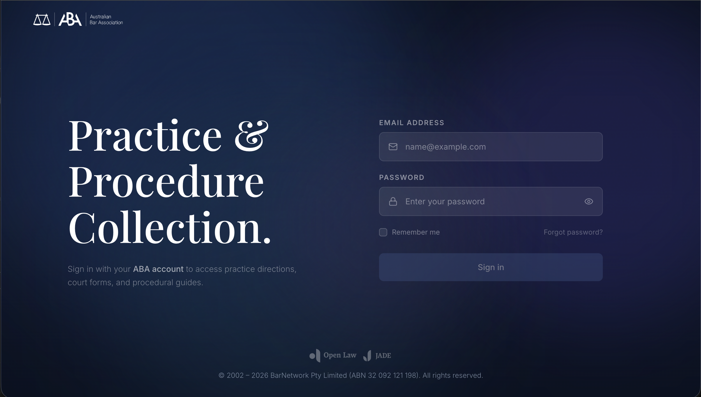
Users had to configure the system before understanding its value.
The ABA platform was designed to help barristers access courts, forms, and legal resources. But the experience created friction before users could even begin.
New users were forced through a heavy onboarding flow: select jurisdictions, add courts, navigate multiple setup screens. ~4 steps before they could touch the product.
What I Heard
I interviewed Michael Green, a practising barrister and the product's primary stakeholder, and Sean Simpson, our librarian SME, to understand how the existing platform was actually being used. The feedback was blunt.
"I hate it too."
On the existing onboarding experience
"It's just a long way of getting to the High Court website."
On the platform's perceived value
"163 forms for Fair Work Commission alone."
On the scale of content that needed structured access
Forced jurisdiction selection before access
Multiple setup screens (~4 steps) blocking entry
Value proposition invisible until setup complete
System-driven flow misaligned with user intent
Reframing the problem
This wasn't an onboarding issue. It was an access problem. Users should be able to start immediately and configure later.
With one week to ship, I used AI to pressure-test the IA. I prompted Claude with the existing 9-jurisdiction × 12-court structure and asked it to surface the navigation patterns a barrister would expect instead of the system-centric tree we had. The output confirmed what the SME interviews suggested: courts are the real-world object, everything else is metadata.
Remove the Onboarding Entirely
Instead of fixing the onboarding, I removed it. Users land directly into the product. Courts can be added optionally. The system is usable from first interaction.
The pushback was predictable: "how will users know what to do without setup?" My answer: they don't need setup, they need a search bar and a question. I prototyped both versions in a day and put them in front of two barristers. The unguided version won decisively, and that ended the debate.
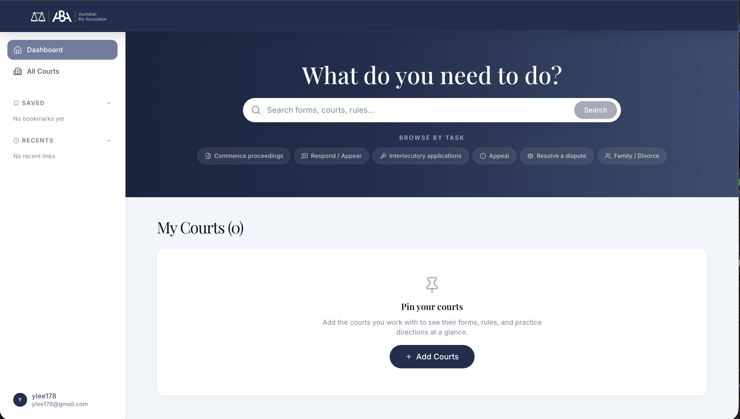
Zero setup required. Two immediate actions available: search anything, or browse by task. The product works before any configuration.
Task-based Entry
The new landing experience opens with a single hero prompt: "What do you need to do?" Supported by search as the primary entry and task shortcuts for common actions: commence, respond, appeal, and more.
Barristers arrive with intent. "I need to file a defence" not "I want to browse." The interface respects that.
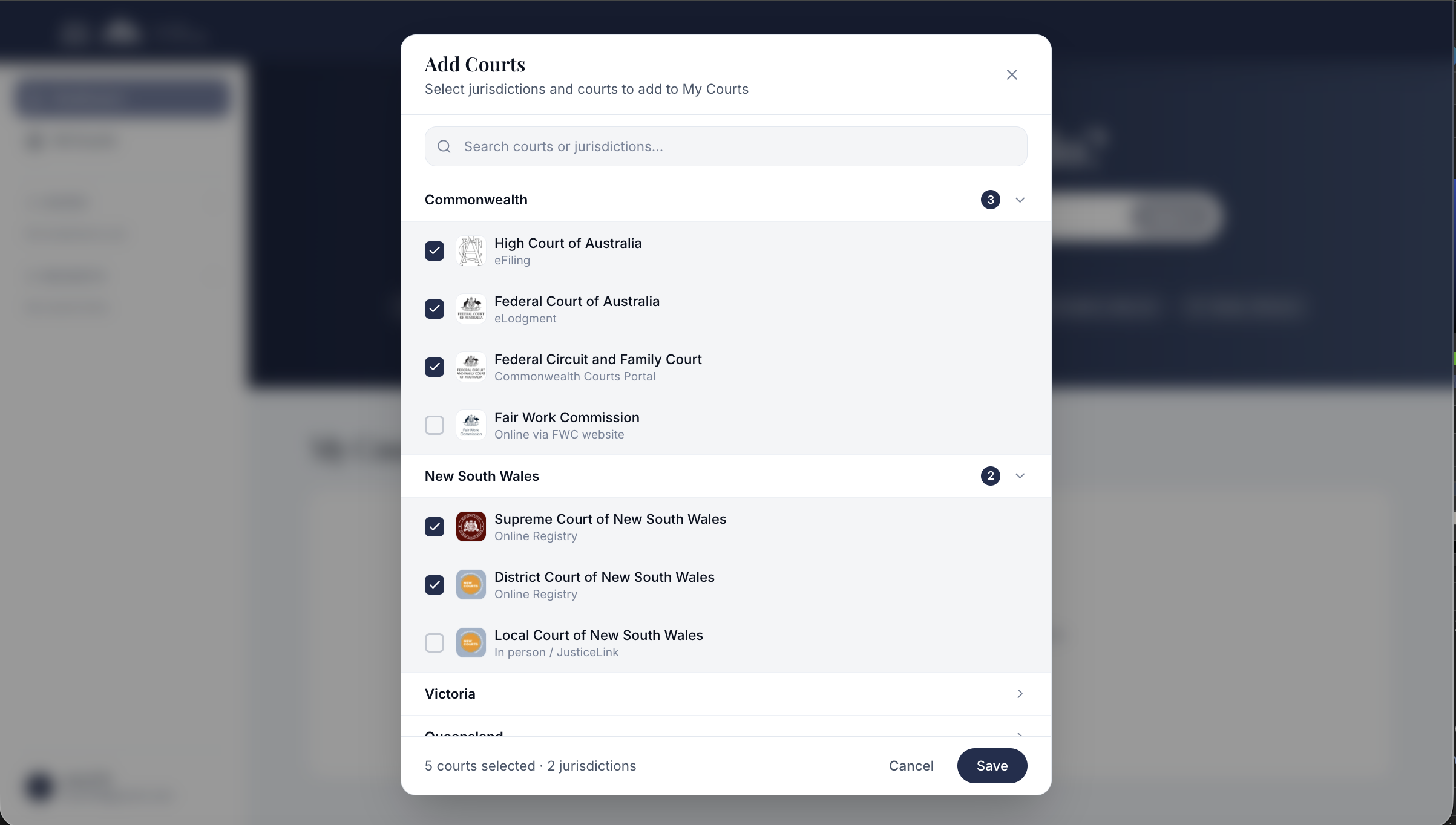
4-step onboarding wizard replaced by a single optional modal. 5 courts, 2 jurisdictions, one action.
Setup When Ready, Not Before
Court configuration still exists, but it's optional and available when the user is ready. Grouped by jurisdiction (Commonwealth, NSW, Victoria), barristers can pin the courts they work with most.
The difference: this is a shortcut, not a gate. The product works without it.
Court-based Information Architecture
The original platform organised content by type: forms in one section, rules in another, practice directions elsewhere. But barristers don't think in document types. They think in courts.
"I need the form for the Federal Court" not "I need to browse the forms section." This insight, validated through SME interviews, drove the entire IA restructure. Courts became the primary object. Each court contains its own forms, rules, practice directions, and fees. 163 forms for Fair Work Commission alone needed structured, court-scoped access.
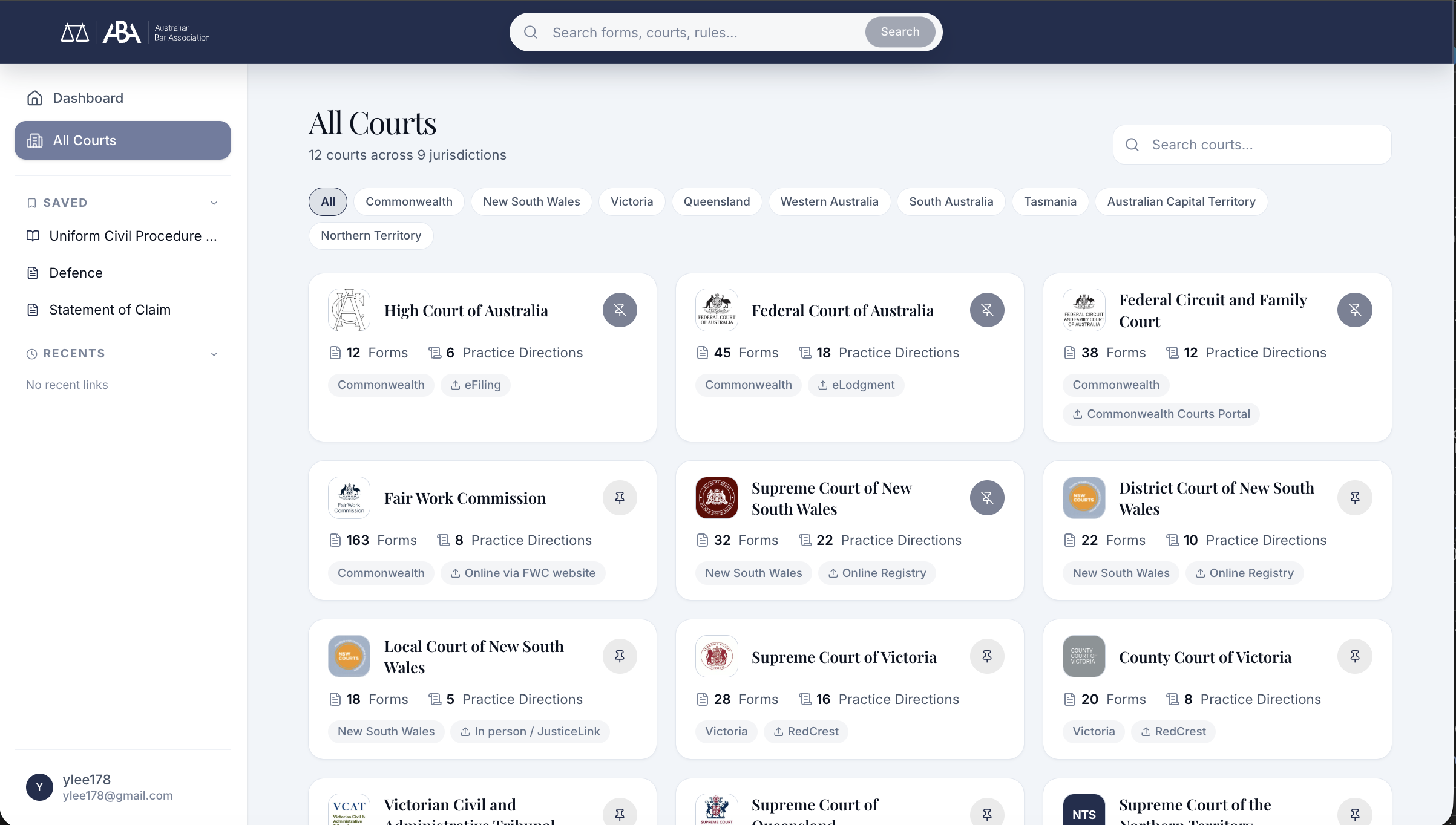
All Courts: 12 courts across 9 jurisdictions. Form counts, practice directions, and filing methods visible at a glance.
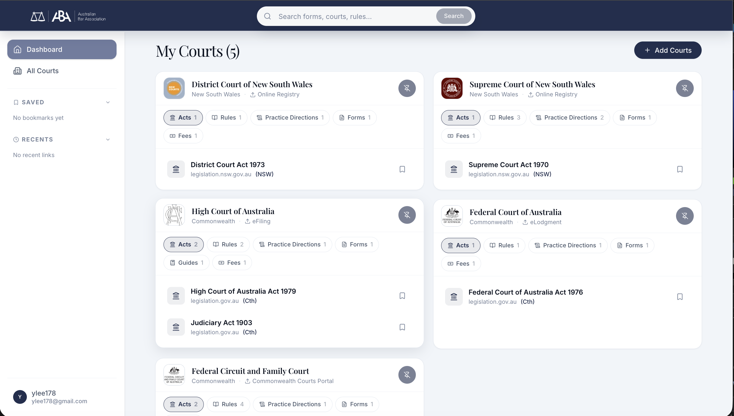
My Courts: pinned courts with relevant acts, rules, and forms surfaced per court
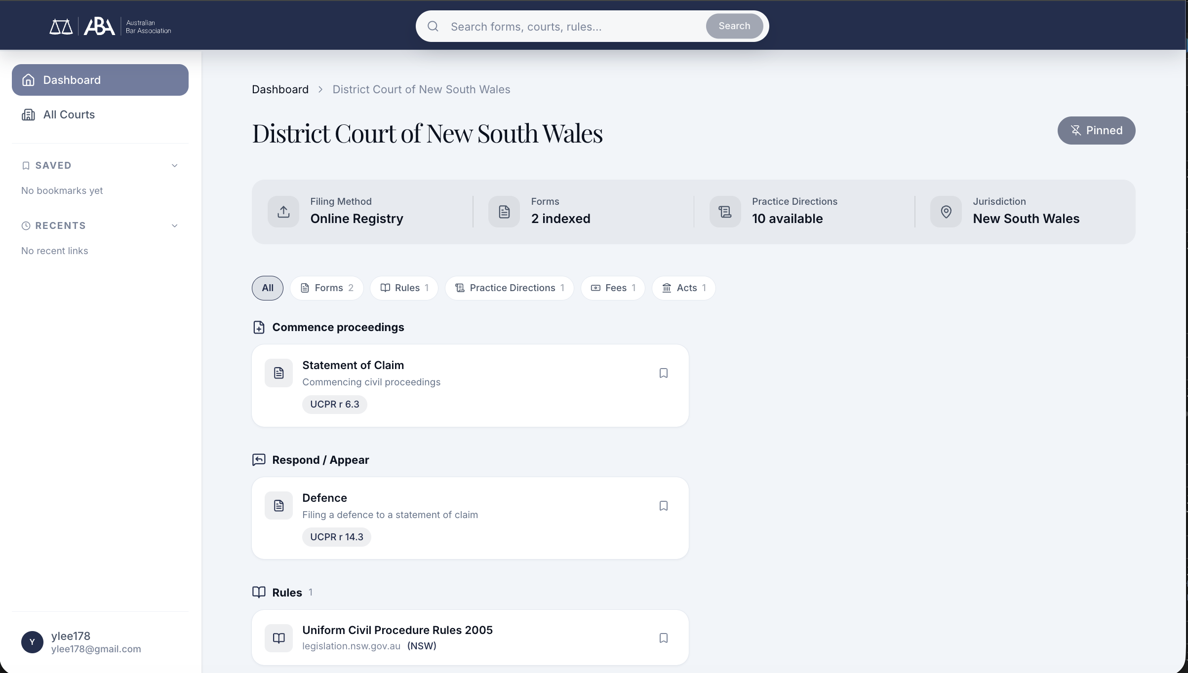
Court detail: forms grouped by task intent. "Commence proceedings" and "Respond / Appear" reflect how barristers arrive at forms, not how a CMS organises them.
Saved Items: Quick Access Over Navigation Depth
Through interviews with practising barristers, I found that users frequently revisit the same items: Defence forms, Statements of Claim, specific court rules. Quick access matters more than navigation depth.
Saved items and recent links persist in the left panel across all views. Return users go straight to what they need.
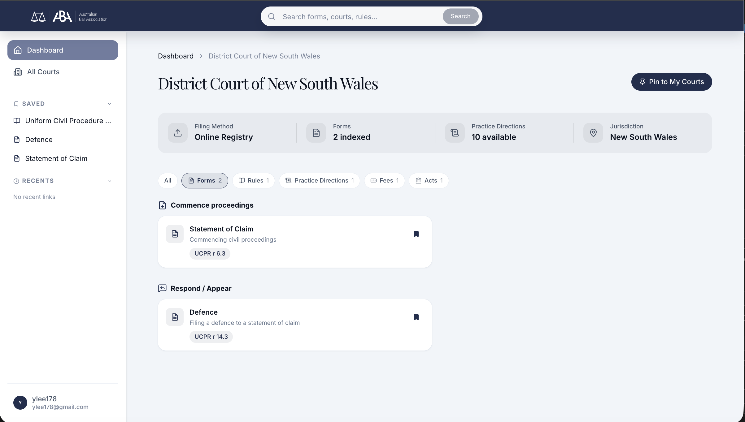
Saved items (Defence, Statement of Claim) and recent links in the left panel, accessible from any page
The key wasn't adding features. It was removing the wrong ones.
Removed Forced Onboarding
Eliminated the ~4-step setup flow. Users access the product immediately.
System-driven → Task-driven
Shifted from "configure your environment" to "what do you need to do?"
Court-based Mental Model
Barristers think in courts, not document types. The IA follows their mental model.
Lightweight Personalisation
Saved items and recent activity instead of heavy upfront configuration.
What shifted in month one.
Read the numbers below as early, directional signal against a small cohort, not a controlled measurement. I'm putting them on the page because they're what I had access to, and because the direction matched what the research predicted.
Time-to-first-useful-action after landing dropped from "blocked at onboarding" to roughly ~30 seconds on median, straight into a task. Barristers who previously hit setup friction before accessing anything were now inside the product in a single step.
I followed up with six barristers from the Open Law subscriber base in week two post-launch. Five of the six completed their first meaningful task, whether that was commence, respond, appeal, or a file path, without any support. The sixth needed clarification on where the federal forms had moved after the IA restructure; that became a labelling fix.
Per BarNet support triage, "how do I get started" tickets dropped from a steady weekly trickle to near zero in month one.
What I owned. The IA restructure: court-based navigation as the primary object, replacing the document-type structure. The removal of forced onboarding (my call, not a committee decision). Task-based entry design and the "What do you need to do?" model. The final decisions on what to cut.
What sat with others after handoff. Engineering implementation sat with the Open Law backend and frontend team. Domain correctness validation, including whether the right forms appeared under each court and whether the AGLC edge cases were handled correctly, sat with Michael Green (barrister) and Sean Simpson (librarian SME); they validated accuracy, not design. Rollout sequencing and timing sat with BarNet product. I call that boundary out explicitly.
The answer was subtraction.
This project moved fast because the problem was clear. PRD, SME interviews, stakeholder feedback rounds, and design iteration compressed into a tight cycle. The biggest design decision wasn't what to add. It was recognising that the onboarding flow was the problem, not the solution, and removing it entirely.