What's the highest-impact entry point for a multi-channel ad platform?
Metigy needed to build a unified multi-channel ad management tool for small business marketers running ads across Google, Facebook, Instagram, and TikTok. Users spent hours switching between native platforms, manually compiling reports and checking analytics across tabs. "Checking analytics" came back as their least-enjoyed task in our survey.
But building everything at once wasn't feasible. The question: where do you start a 0→1 product to deliver the most value fastest?
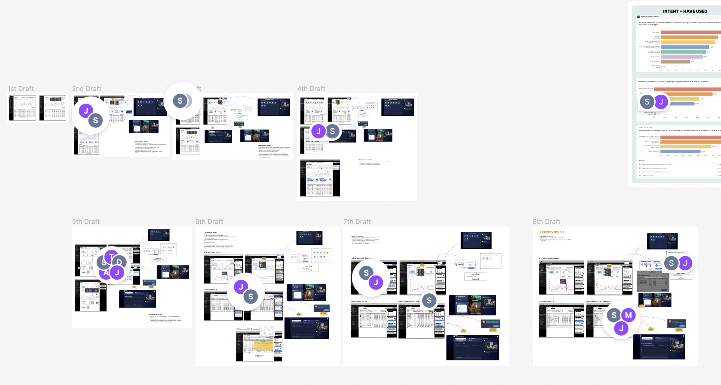
75 Users Answered
I ran a quantitative survey with 75 potential users. Among the 32 "advanced users" managing multiple ad channels, the data pointed clearly: analytics checking was the most painful task, and reporting was voted the most important feature for an all-in-one platform.
The entry point wasn't assumed. It was discovered.
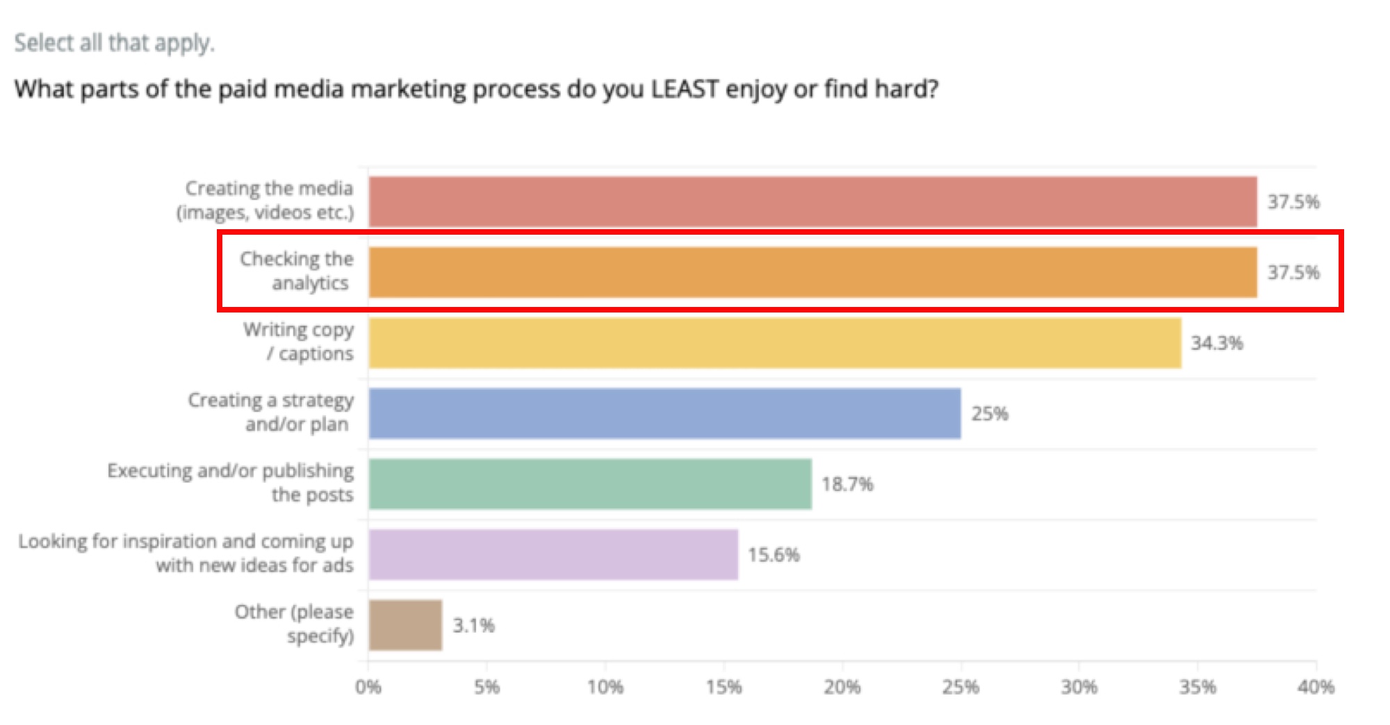
Analytics checking ranked as the most painful task
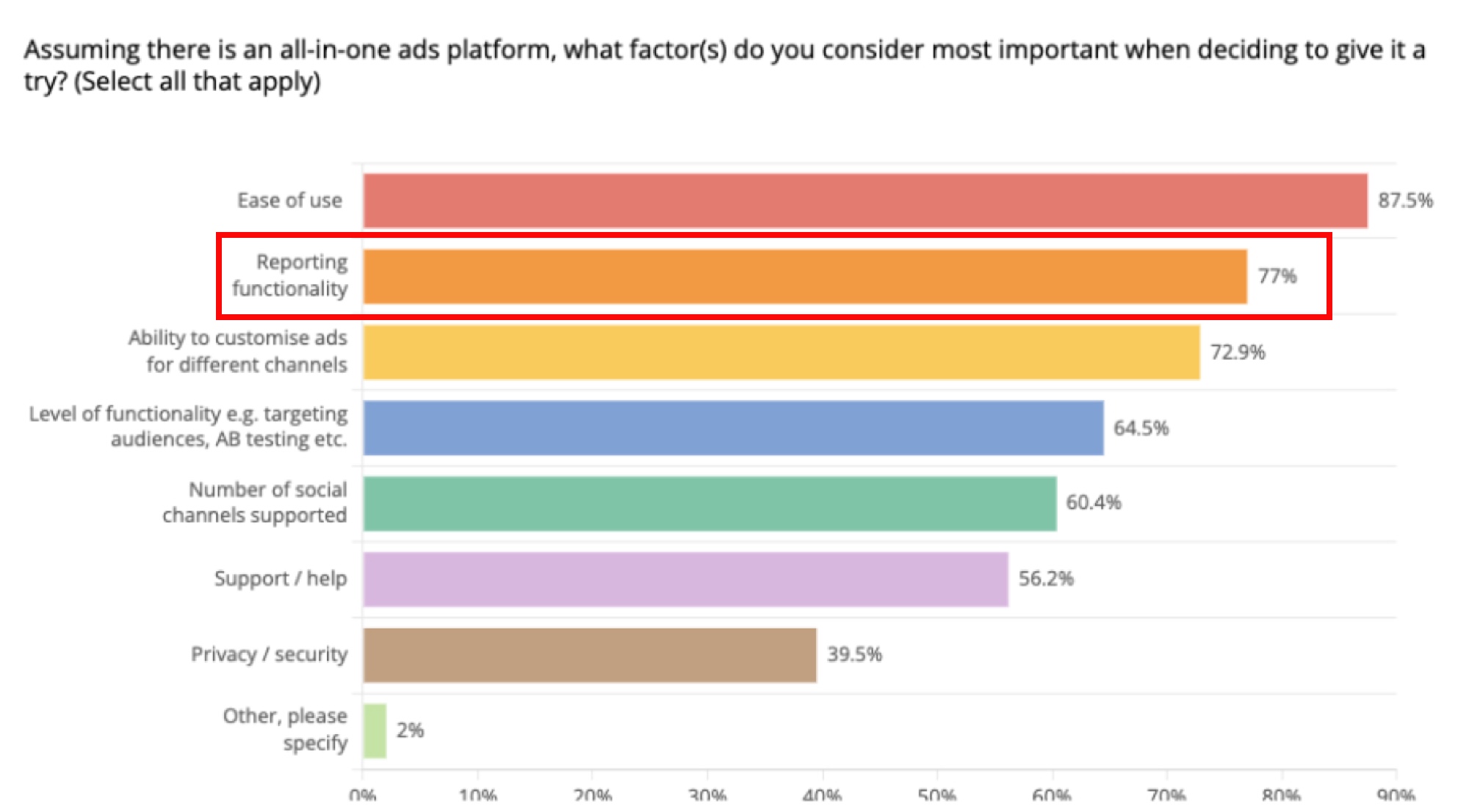
Reporting ranked most important for an all-in-one platform
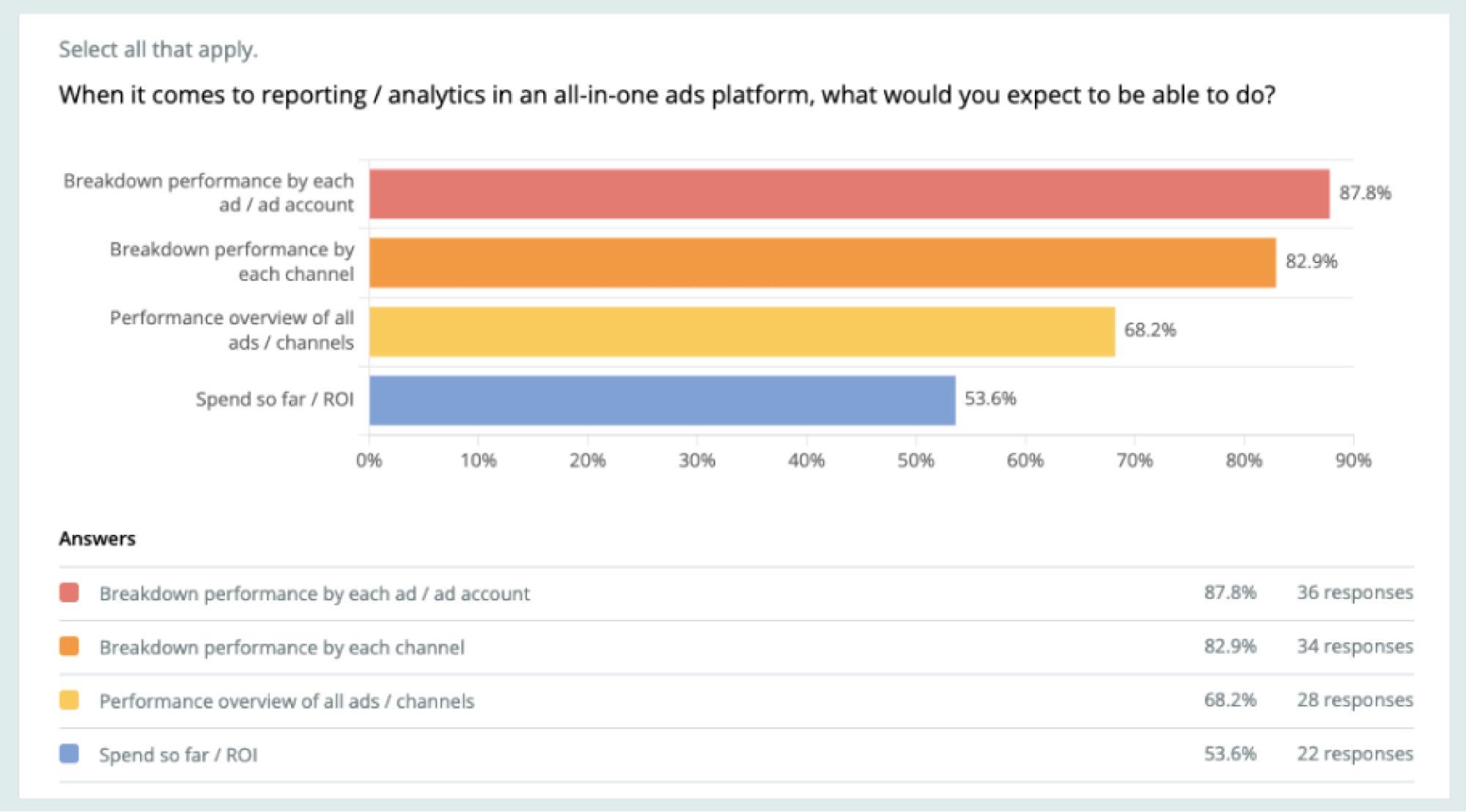
Mapping user needs from survey data to dashboard requirements
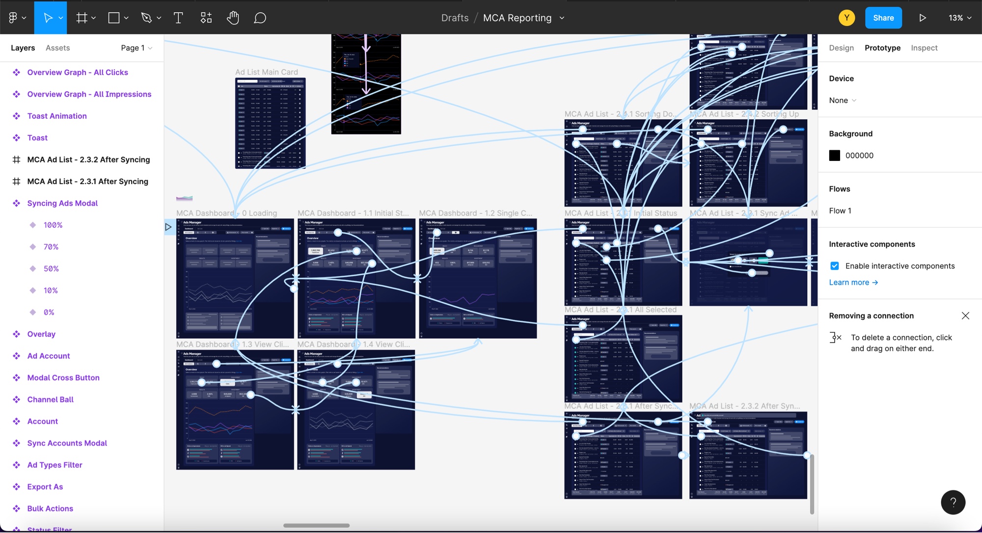
Eight iterations before committing to hi-fi.
From the survey data, I mapped user needs to dashboard requirements and pressure-tested them against reporting patterns from native platforms and direct competitors. Eight low-fi rounds with the Ads squad and data team before any pixel went hi-fi.
Testing with 6 Real Users
"Ease of Use" was rated the most important factor, so I chose high-fidelity prototypes for testing. Collaborated with PM and Researcher to craft non-leading questions, and recruited 6 users (4 advanced, 2 novice) managing multi-channel paid ads.
High-fidelity prototype used for usability testing
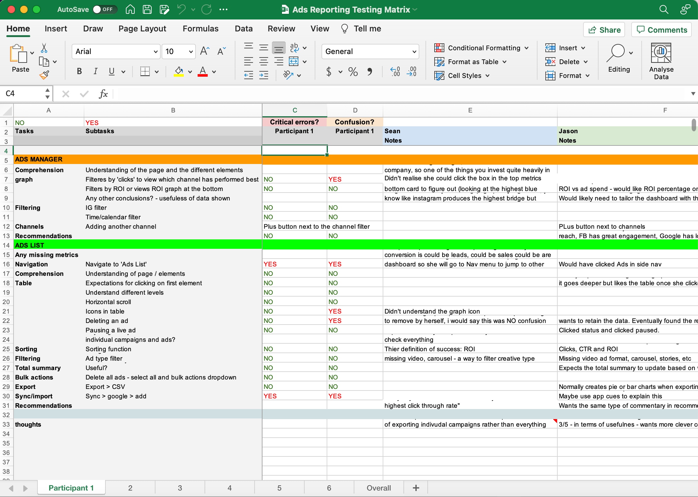
Structured approach to capturing and analysing feedback
Insights mapped directly to prototype locations for targeted iteration
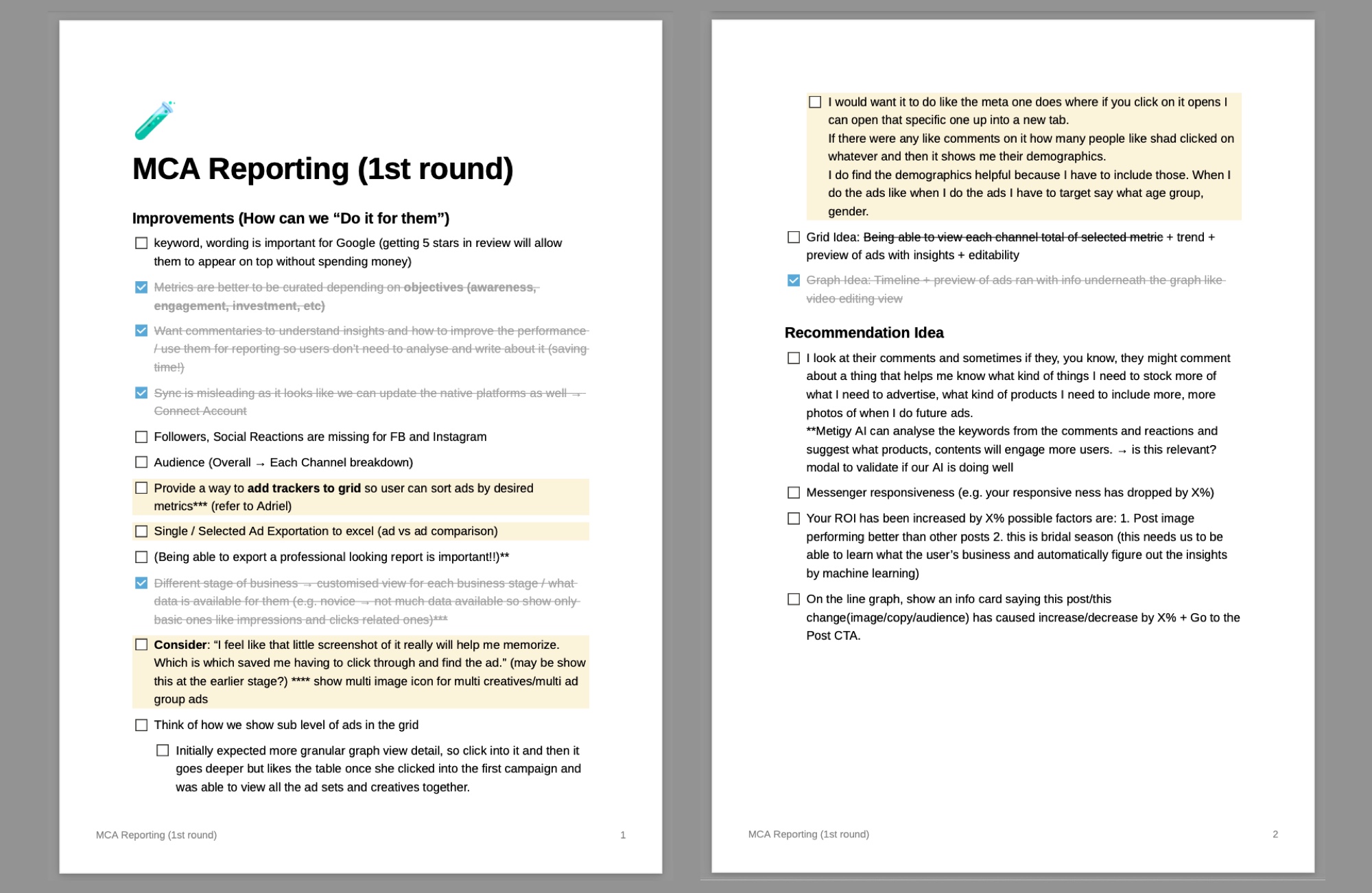
"There are many reporting platforms out there and they seem to focus only on making beautiful graphs."
What Worked
Consolidated reporting highly valued. No more jumping between platforms. Comparison cards immediately appealing for identifying best-performing channels.
What Needed Change
Users had different goals depending on business stage, so one-size-fits-all metrics wouldn't work. Core value prop was saving time: users wanted commentary and insights, not just charts.
Interpretation over visualisation.
The biggest insight from testing was that the platform's value wasn't in displaying data. It was in interpreting it. The market was full of tools making "beautiful graphs." Users wanted a system that reads across channels, explains what changed, and tells them what to do next.
I designed two AI-assisted surfaces that turned raw data into specific recommendations:
AI Insights Panel
An AI-assisted surface that interprets dashboard data, explains likely causes, and recommends next actions. Not just "your CTR dropped" but "your CTR dropped because X, so try Y."
Keywords & Topics
Another AI-assisted surface that reads search keywords, comments, and reactions across channels, surfacing content opportunities and creative directions.
Testing also revealed that one-size-fits-all metrics fail because users have different goals depending on business stage. I designed differentiated dashboards so early-stage users see awareness metrics, while advanced users get rich ROI and conversion data with goal-based filtering.
Early-stage user dashboard: awareness and engagement focus
Advanced user dashboard: rich ROI and conversion metrics
The signals below come from pre-launch testing with advanced-user prototypes, not production usage. Read them as directional validation of the interpretation-first hypothesis, not market impact.
Interpretation-first layout: task time
5 of 6 pre-launch testers correctly identified the top-performing ad within ~30 seconds using the new interpretation-first layout, compared to ~3 minutes in the current Metigy dashboard.
Layout preference: prototype comparison
4 of 6 advanced users preferred the interpretation-first layout in head-to-head prototype comparison. The other two wanted raw-data access preserved. That shaped the final toggle design so neither group was penalised.
These are pre-launch testing signals, not production metrics.
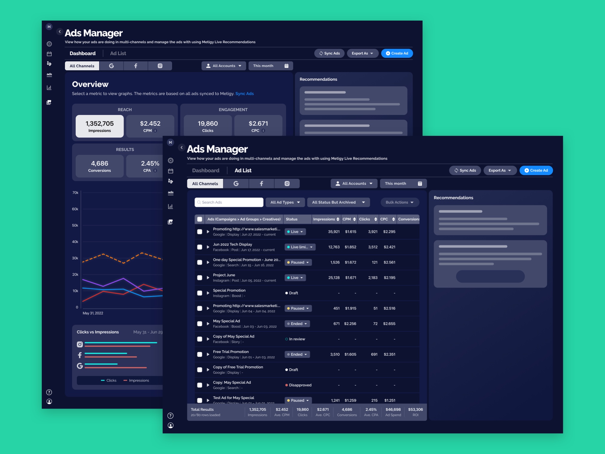
The complete multi-channel ads creation flow
Phase 2 was the full creation flow, with AI assistance beyond the dashboard.
Phase 1 was the reporting side: a 75-user survey, 8 rounds of lo-fi iteration, and the two AI-assisted surfaces (AI Insights Panel and Keywords & Topics) that interpret performance across channels and recommend what to try next. Pre-launch testing validated the interpretation-first direction.
Phase 2 was the full ads creation flow shown here. AI assistance moved past the dashboard and into the rest of the workflow: campaign setup, targeting, creative, and optimisation. The robot markers along the diagram show where the system supports the user across the journey, not only at the reporting end.
What I owned. Research design: the 75-user survey instrument, screener criteria, and analysis. Information architecture for the dashboard and reporting surface. The AI Insights Panel concept and its interpretation-first layout. Keywords & Topics feature design. Usability testing facilitation across all six sessions, including script design and synthesis.
What sat with others. Roadmap prioritisation and cross-feature tradeoffs sat with the PM. Participant recruitment and session note-taking support came from the user researcher. The data team owned the backing signal models that would have powered the AI Insights Panel. Engineering was running a parallel build that never shipped. Calling out the boundary matters here especially. When a 0→1 product doesn't ship, attribution can drift toward whoever's still in the room. I'd rather be honest about which calls were mine to make.