Designing information architecture for over a century of reported case law.
Victorian Reports is the authorised law report series of the Supreme Court of Victoria, published since 1905. Print copies carry institutional weight by existing on a shelf. The digital platform needed to carry that same authority. It wasn't.
The website read as generic. Authority was buried. Case discovery was fragmented. Subscription paths were unclear. Enterprise buyers couldn't find invoice options. Print-first thinking hadn't been translated to digital-first design.
The Digital Gap
The print copies carried a century of institutional weight. The digital platform did not. Authority that was self-evident on paper had to be earned back on screen, and the current platform was not doing that. Subscription paths were unclear, case discovery was fragmented, and the reader lacked the legal-text structure practitioners expected.
Authority not communicated at first contact
Fragmented case discovery across practice areas
Print vs digital subscription confusion
No unified case library or reading experience
Four research threads before restructuring the platform.
Simulated the first-impression experience in the seconds-long scan window before commitment across the existing platform, surfacing structural weaknesses in authority signalling and hierarchy fast before any user was burdened with them.
Four interviews with long-standing subscribers, two barristers, one solicitor, and one library purchaser, to pressure-test whether the AI-audit signals matched real usage.
Walked the subscription and print-to-digital migration flow with the Victorian Reports editorial team. This surfaced the institutional constraints and billing edge cases that user-side research couldn't.
Reviewed support tickets across the prior 12 months. The same three points kept surfacing: authority not legible at first contact, subscription paths unclear, and a reader lacking the legal-text structure practitioners expected.
The findings converged cleanly across threads: authoritative content deserved authoritative design. That convergence was what I used to restructure the platform's information architecture, not any single thread on its own.
Homepage: Authority at First Contact
Restructured the entry experience so "official" and "authorised" are felt instantly. Official title elevated above the logo. "Authorised Reports of the Supreme Court" at first cognitive contact. Search-first architecture because legal professionals arrive with intent, so the interface respects that.
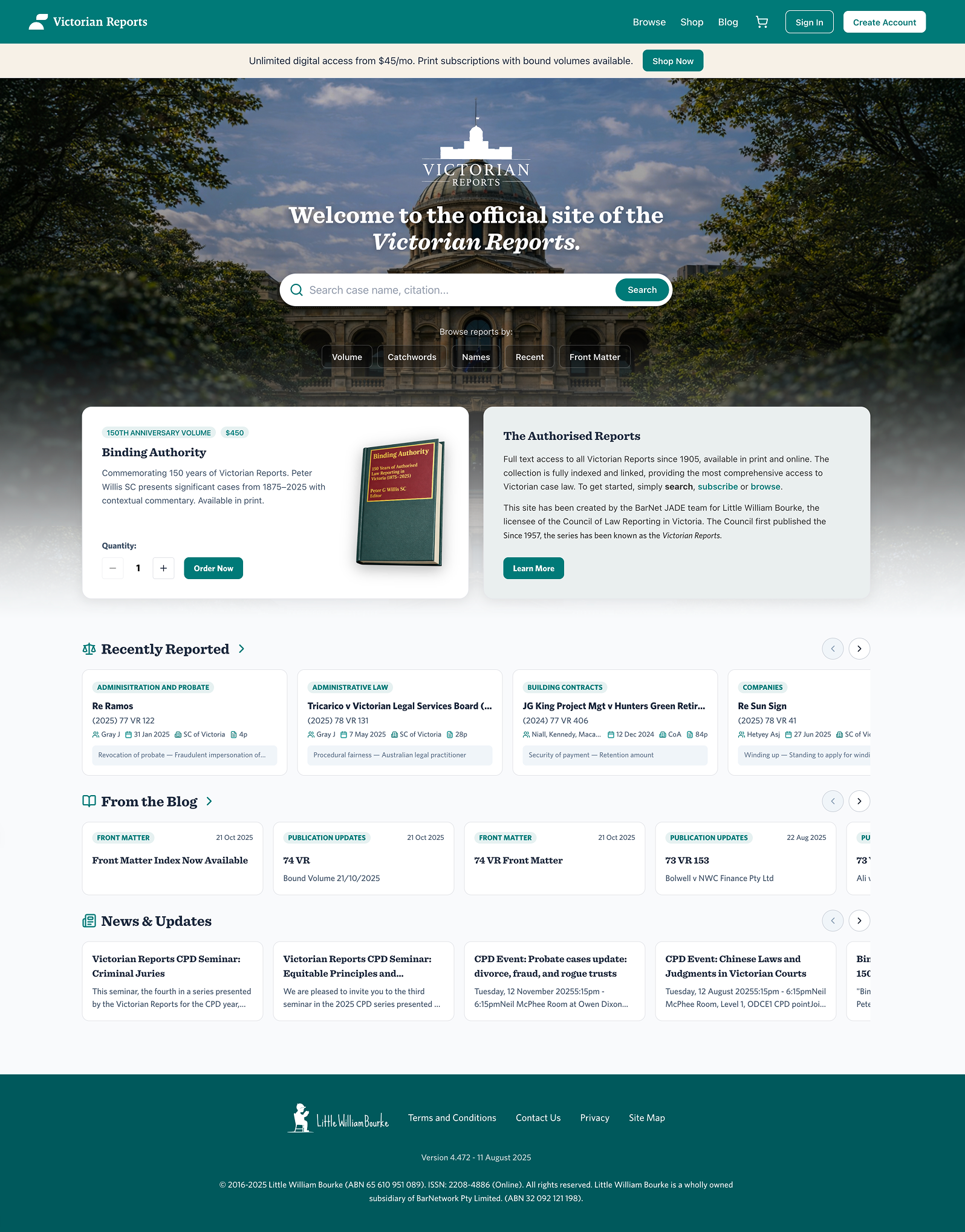
Case Discovery System
A unified case card system across Home, Browse, and My Reports used the same anatomy and the same scan pattern. Every card optimised for scan-first comprehension, with practice area, citation, court, judges, and decision date legible in a single glance. Legal professionals scan, they don't read.
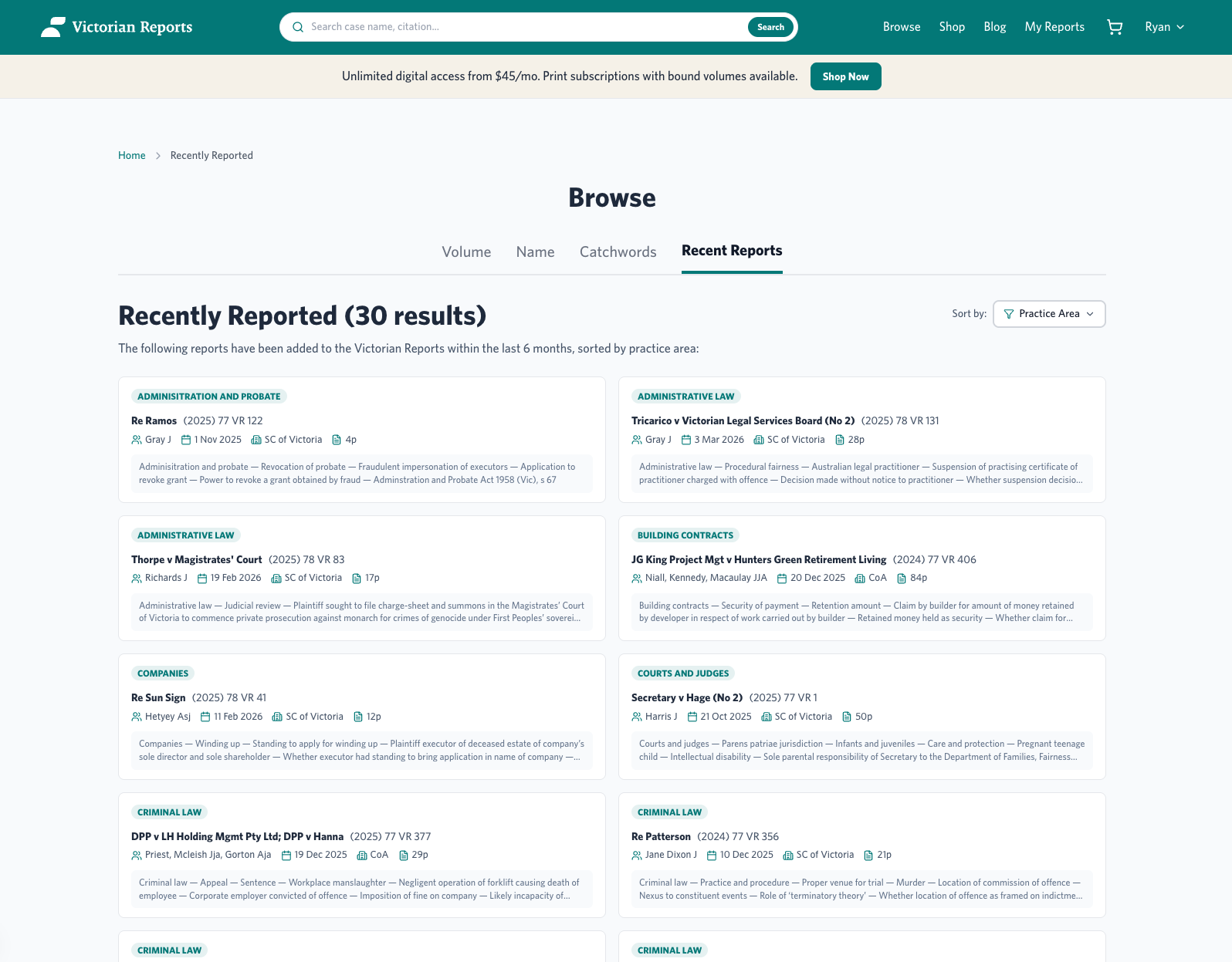
Recently reported cases: practice area tags, metadata, citations
Subscription Architecture: Three Access Models
Victorian Reports serves different legal workflows. Digital researchers need instant access. Law firm libraries need print volumes. Many need both. The subscription system had to respect all three without creating confusion.
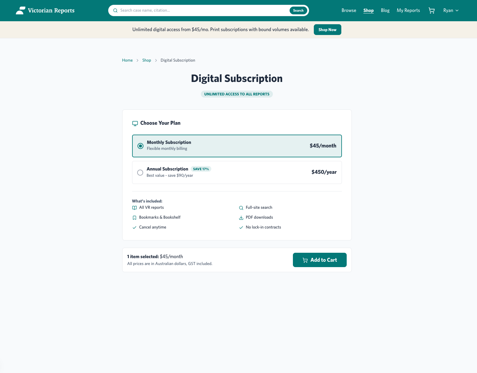
Digital subscription: online access to the full case library
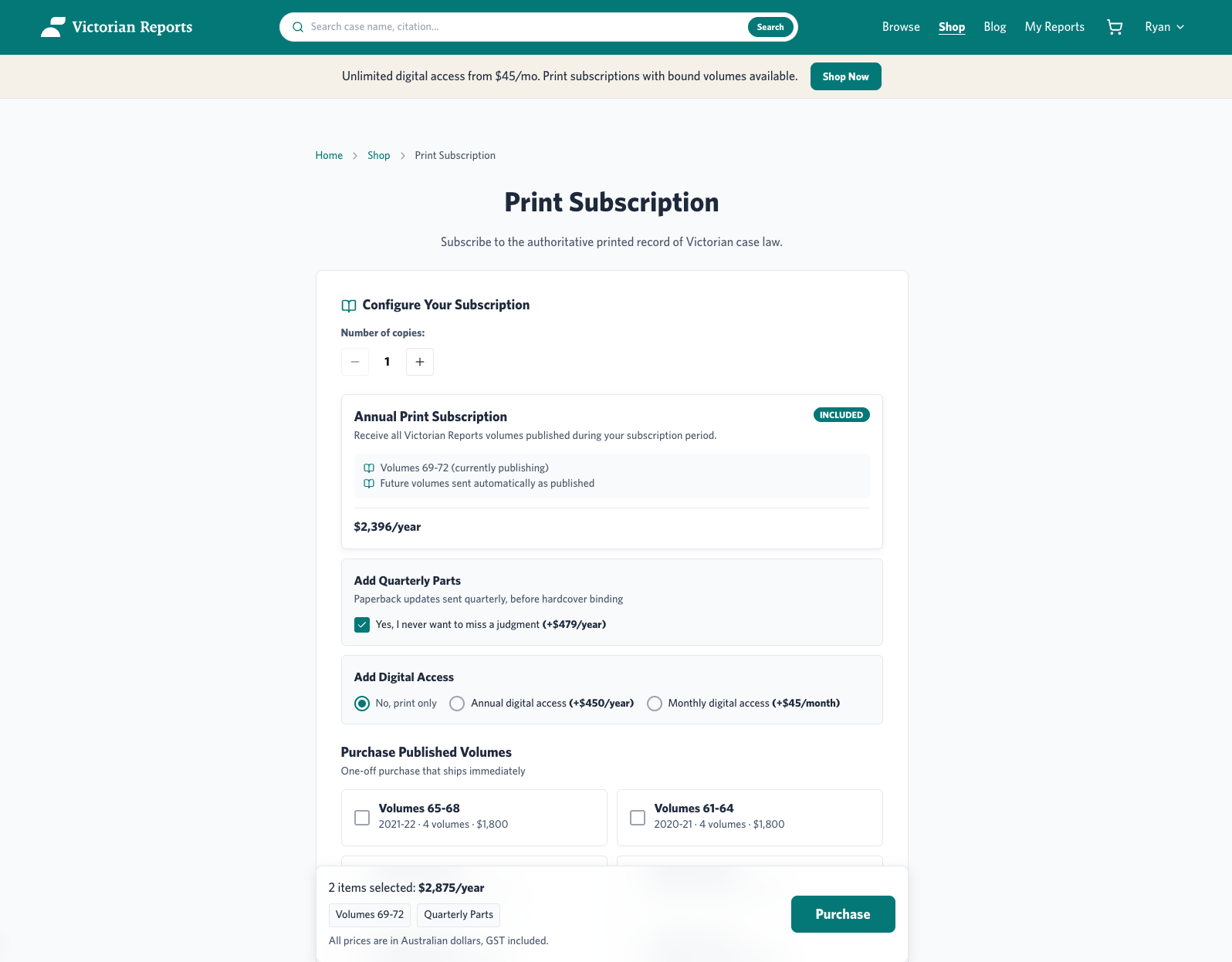
Print subscription: physical volume delivery
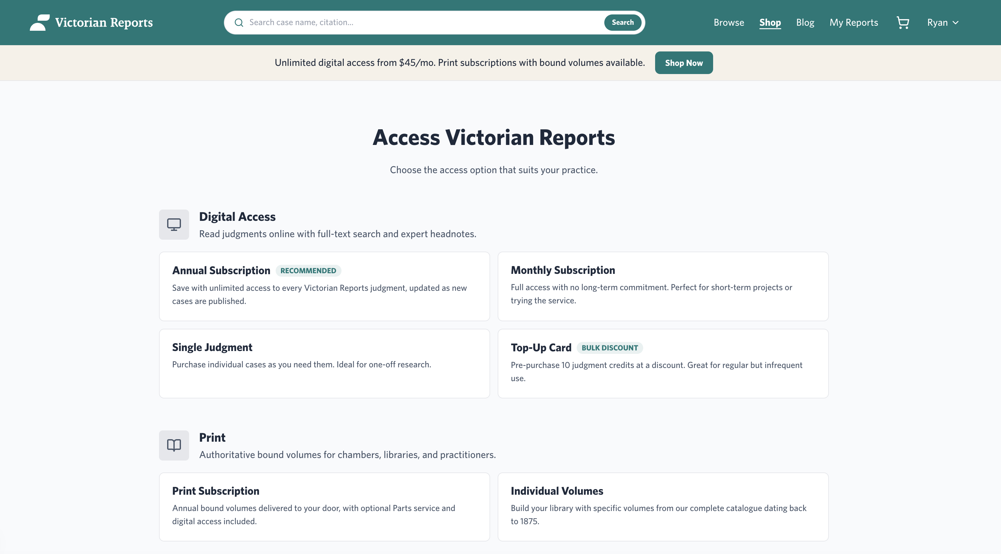
Judgement reader: legal text structure preserved with digital navigation
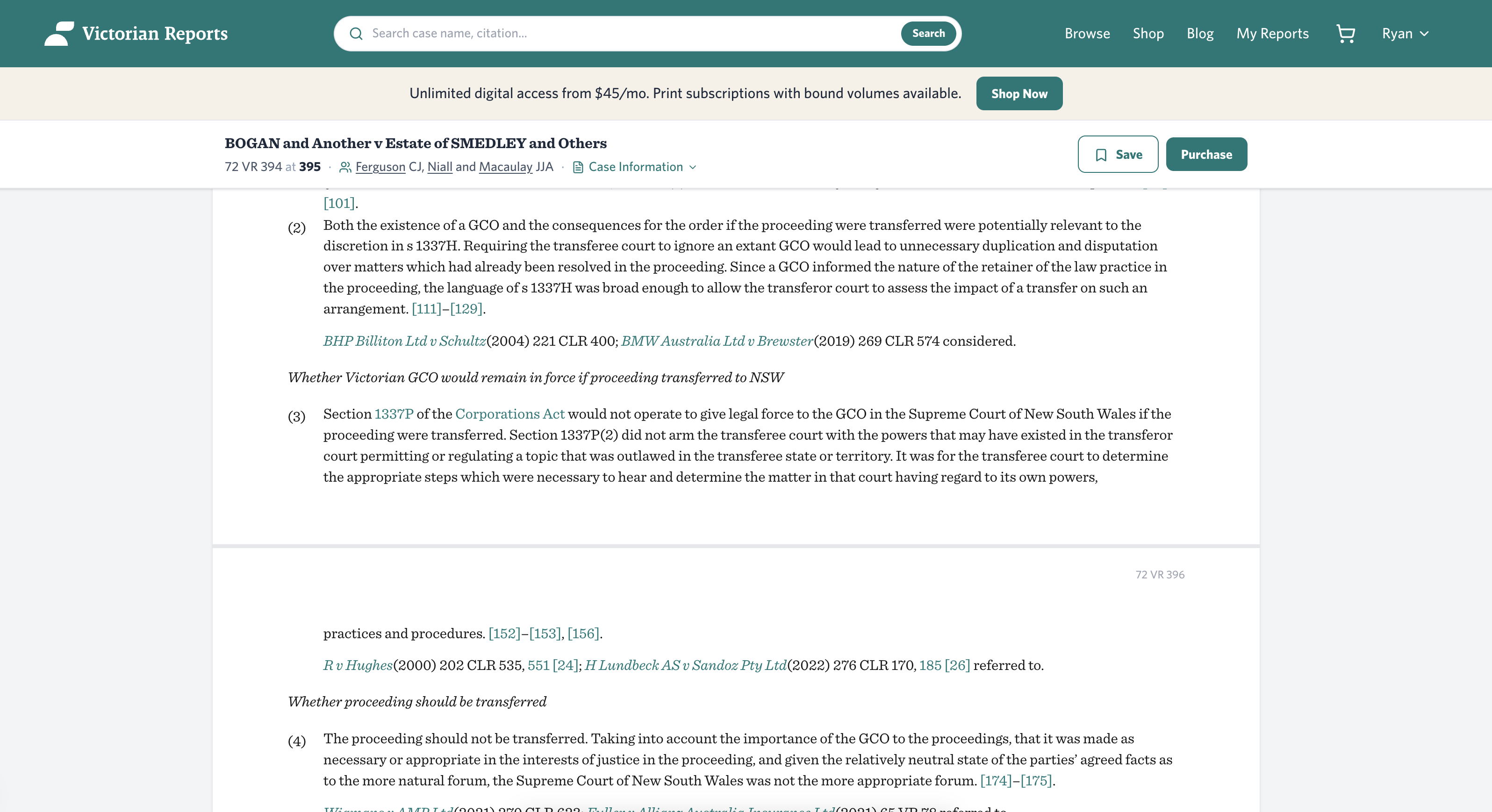
Preserving Legal Structure in Digital
Legal texts have a specific structure: headnotes, catchwords, counsel, judgement body, citations. The reader was designed to preserve the hierarchy that lawyers rely on while enabling digital-native navigation, search within case, and cross-referencing.
This is where legal domain understanding matters. The structure isn't decorative. It's functional. Lawyers navigate cases by structure, not by scrolling.
Personal Case Library + Account Management
Lawyers build personal case libraries over years. My Reports lets users manage saved and purchased reports in one place, with clear distinction between saved (bookmarked) and purchased (owned) cases.
Account dashboard centralises subscription status, billing, and report access. Simplified so legal professionals manage their subscriptions without calling support.
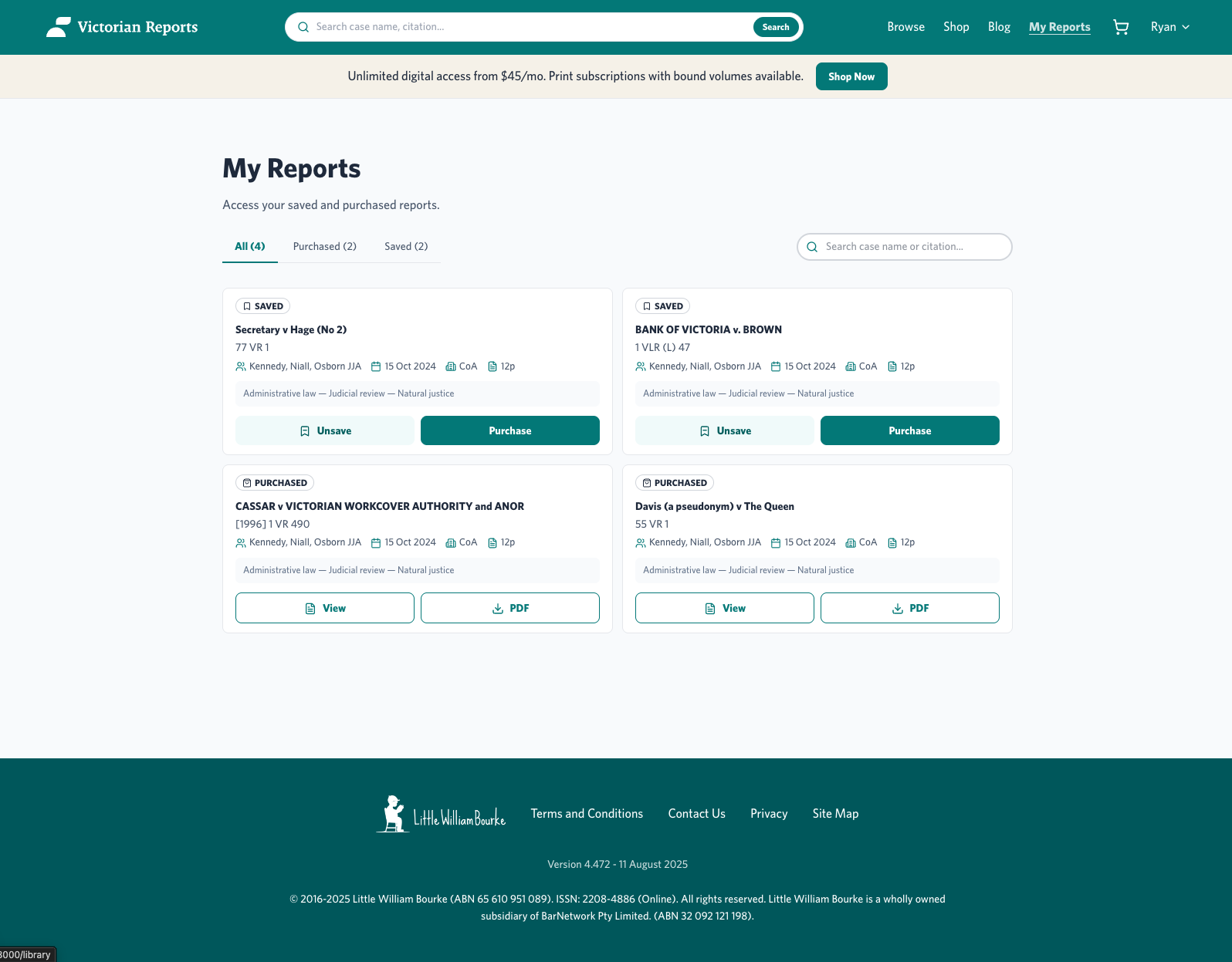
My Reports: saved and purchased case management
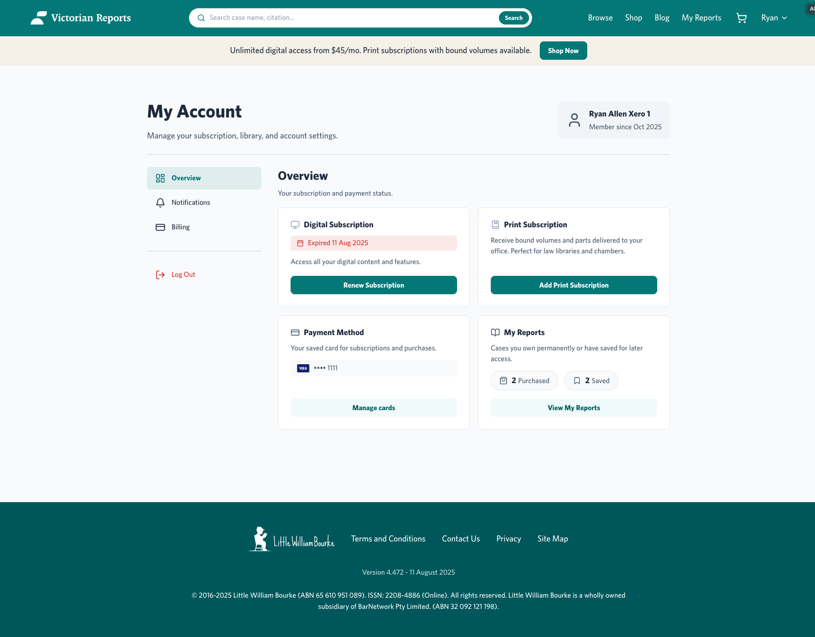
Account dashboard: subscription, billing, access
Designed the platform. Then coded it to production.
This wasn't a handoff project. I designed the system, then pushed front-end code to production: page redesigns, design system with Storybook, and efficiency improvements. Design-to-code ownership meant faster iteration and fewer translation losses.
Full Platform Redesign
Homepage, case browsing, reader, subscriptions, account. Designed and coded.
Design System
Built with Storybook through real product work, not in isolation. No developer dependency. Still in active use across the platform today.
Authority-First IA
Information architecture designed for institutional credibility. Official court title elevated above logo at first cognitive contact.
CPD Material Restructure
Session hierarchy, pricing clarity, bundle pricing. Stakeholder requests shipped as structured digital materials.
Post-launch first 60 days, per internal analytics shared by the Open Law editorial team: subscription-page drop-off down roughly ~22% quarter-on-quarter; case-page time-to-first-interaction dropped from a median ~35 seconds to ~12 seconds.
~22% drop in subscription page drop-off
Quarter-on-quarter comparison, per Open Law editorial analytics. Attribution is to the subscription architecture redesign and the authority-first homepage restructure.
~35 sec → ~12 sec time-to-first-interaction
Median case-page engagement, post-launch first 60 days. The case card anatomy and authority-signal system were designed for first-glance legibility; the numbers suggest the principle is holding up in real use.
I did not have access to revenue or conversion-revenue data, so commercial impact is outside what I can claim here.
What I owned. IA redesign across the full platform. The authority-signal system: positioning, hierarchy, and the institutional credibility logic. Subscription architecture redesign across Digital, Print, and Hybrid paths. Legal reading-experience decisions (case card anatomy, reader structure). Front-end code for the primary marketing surfaces and case reader shell, shipped to production.
What sat with others. Backend infrastructure sat with Open Law engineering. Editorial content migration and CPD material curation sat with the Victorian Reports editorial team. Legacy print workflows and the physical dispatch system sat with the publisher. Commercial pricing decisions were made by the Open Law commercial team. Drawing the line matters because the platform's authority depends on both the design system and the editorial layer, and I want it clear which I shipped.