A smart home that looked like a settings panel.
Eva Smart Home needed a tablet control app that could differentiate from competitors. But the existing interface was flat, button-heavy, and indistinguishable from a generic settings panel. There was no spatial connection between the interface and the physical home it controlled.
For a product positioned as premium and futuristic, the control experience undermined the brand promise at the most frequent touchpoint: the moment users interact with their home.
The existing button-based EvaOS interface: functional but undifferentiated
Flat buttons with no spatial awareness of the home
Indistinguishable from any generic IoT control panel
Zero "wow factor", undermining Eva's premium positioning
Inspiration & Research
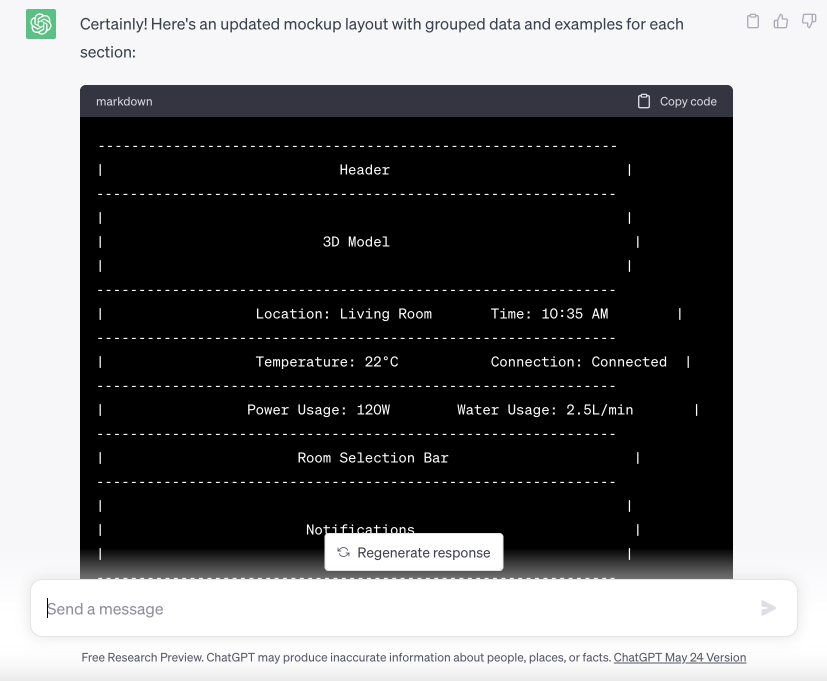
I researched 3D interface precedents across gaming, automotive, and industrial UIs, identifying spatial patterns that could translate to home control. Used AI to rapidly generate layout concepts and spatial arrangements, exploring control placement, room navigation, and information hierarchy within a 3D space. The developer created a technical roadmap mapping prototype capabilities to design ambitions.
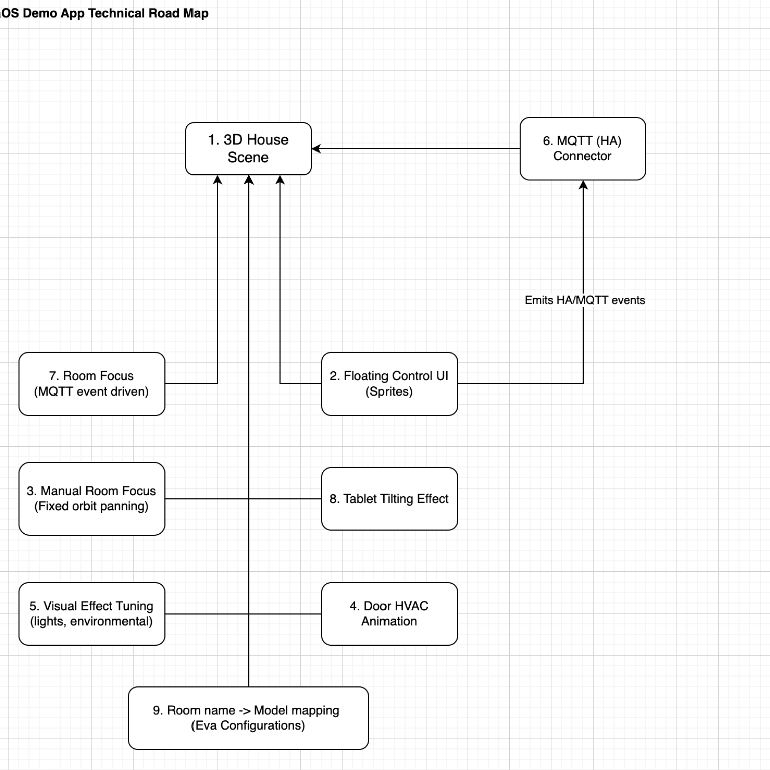
Technical roadmap aligning design ambition with engineering reality
AI-assisted layout concept generation, accelerating early ideation
From paper to prototype. Two testing phases that converged on isometric.
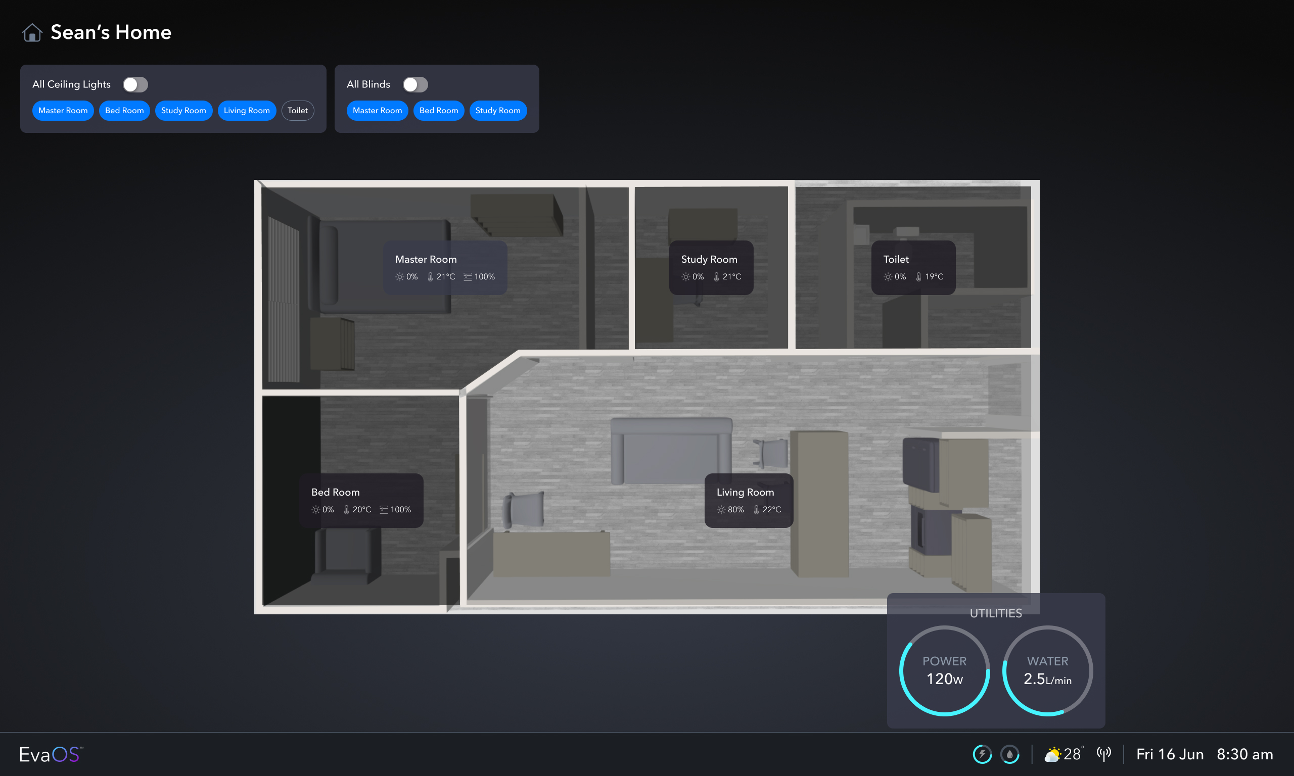
Lo-fi testing validated which actions were priority and which layout pattern users preferred. The V1 high-fidelity round then put two layout directions head-to-head — a bird's-eye view and an isometric view — with the same testers performing the same scenario in both. Isometric was the design users preferred and found easier to use. With direction confirmed, I refined the interaction details into the final prototype.
Lo-fi: paper sketches used to validate priority actions and layout preference
Priority actions and layout preference, validated.
I walked testers through paper sketches to learn which actions mattered most in daily use (lighting, scenes, climate) and which layout patterns read most naturally. The signal was clear enough on both questions to greenlight high-fidelity, where I'd test two layout directions head-to-head.
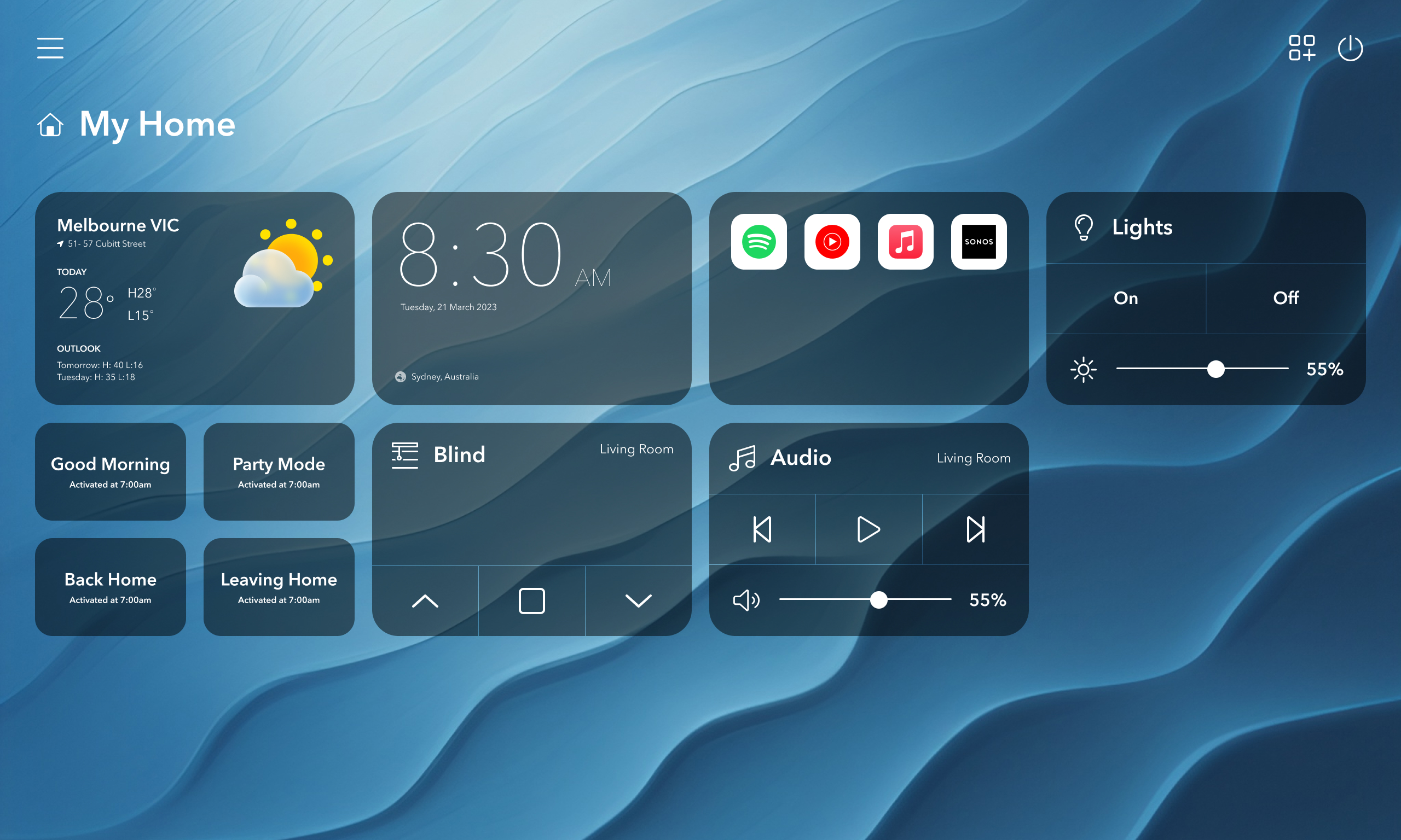
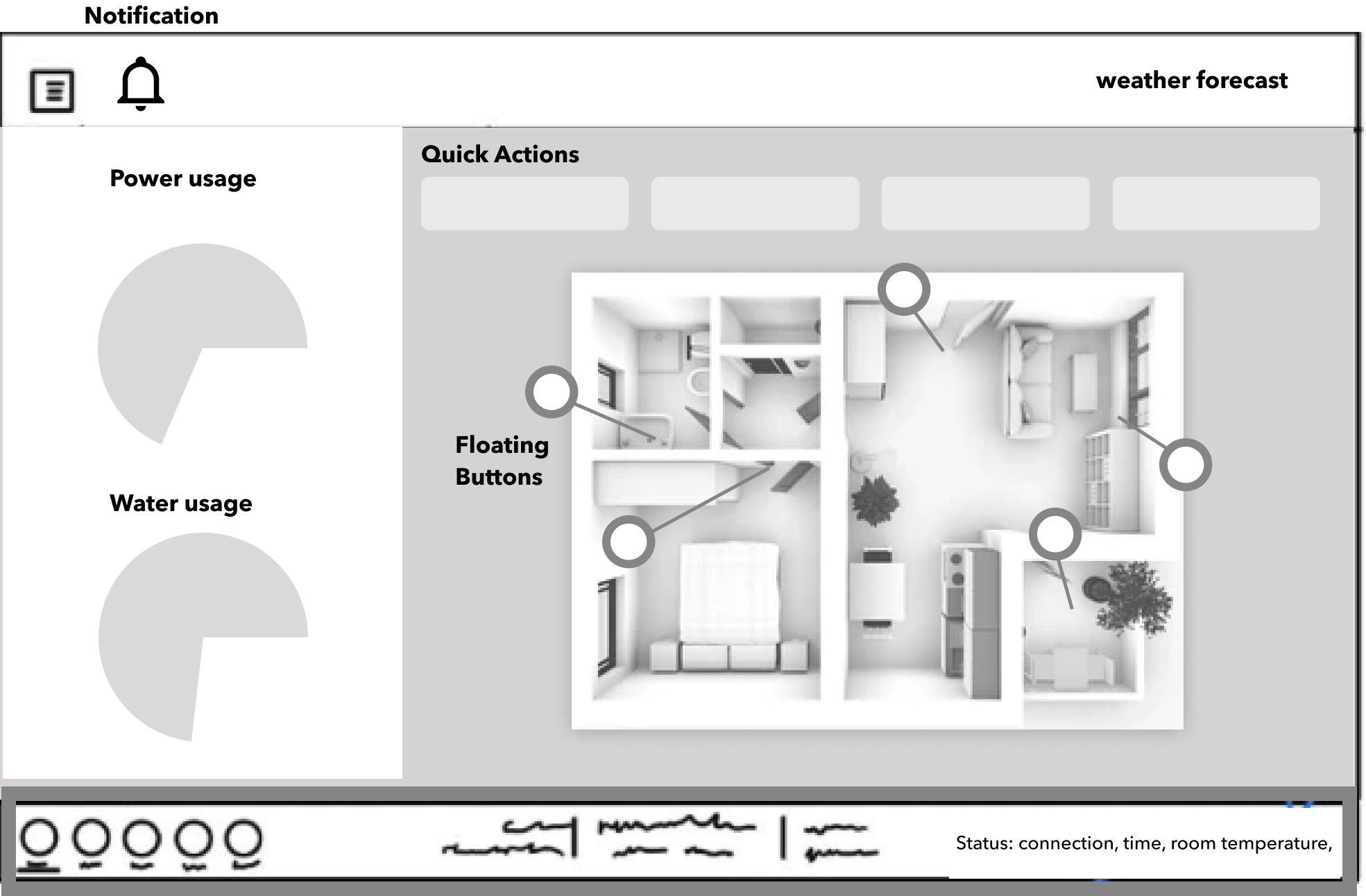
Option A · bird's-eye + tabs
Option B · isometric + SpaceX-inspired controls
Isometric won. Users preferred it and found it easier to use.
What testing showed
Bird's-eye tabs read as navigation, not controls. Testers tapped a room tab expecting to "go to" the room, then waited for a transition that never came.
Isometric carried spatial context naturally. The 3D model showed which room was being controlled without nesting modals or relying on tab labels — testers reached for the right control on first contact.
Direction confirmed
Killed bird's-eye. Locked the isometric paradigm and refined the interaction details within it.
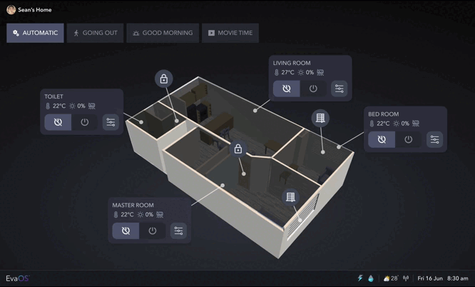
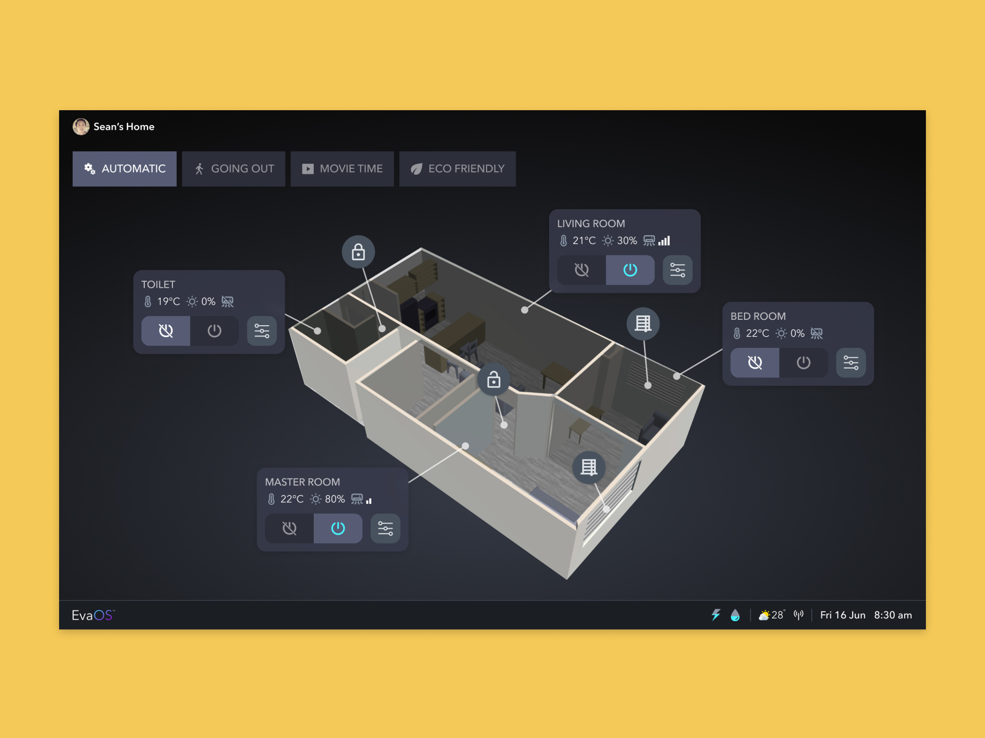
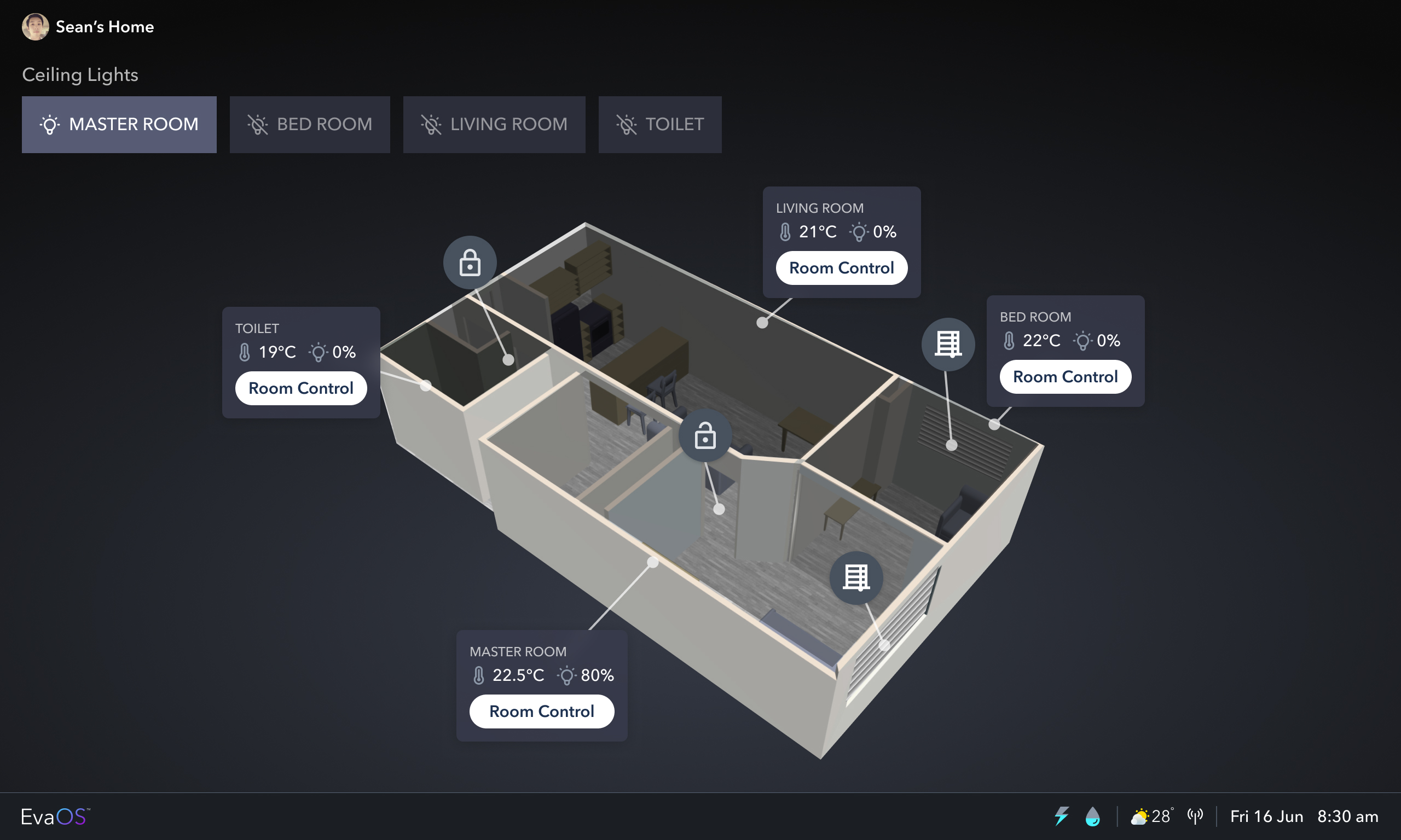
The final prototype: refined isometric interface, the form Wallace took into investor demos
The completed prototype, after testing confirmed direction.
With the isometric paradigm validated, I refined the interaction details — explicit room selection in the spatial model, industrial-style controls that read as controls on first contact, and motion that reinforces what's being controlled. This is the form Wallace took into investor demos.
The interface became the product's centrepiece.
Per the Wallace founder, the 3D spatial interface became the primary investor-demo moment through 2023. It was the beat in the pitch that drew questions. What started as a control panel redesign became the visual identity of Eva's brand.
Usability validated through lo-fi and a head-to-head V1 test: innovative enough to differentiate, intuitive enough for daily use. The SpaceX-inspired aesthetic gave authority; the spatial awareness gave intuition. This wasn't a design exercise. It was the joint product of tight designer-developer co-creation, every iteration a conversation rather than a handoff.
I do not have access to later commercial outcomes. Post-demo decisions sat with the Wallace founding team.
Investor centrepiece: the 3D interface became the demo moment in Eva's product pitch
Usability validated: isometric chosen by users over bird's-eye in head-to-head V1 testing
Brand promise delivered: Eva's futuristic positioning finally matched by the control experience
What I owned. The interaction model: the decision to use an isometric 3D spatial grammar rather than flat controls, and each subsequent iteration decision. 3D information architecture: how rooms, zones, and controls are organised in space. Visual direction across approximately 8 core screens. Usability-testing design, facilitation, and synthesis across both the lo-fi validation and the V1 head-to-head test.
What sat with others. The lead developer owned implementation and the technical roadmap for the 3D rendering engine. Every design decision I made was bounded by what was feasible in the engine. The Wallace founder and CEO owned the product brief and all investor-facing positioning decisions. I call that boundary out explicitly.