~30 signups per day. That was the ceiling.
JADE is Australia's most comprehensive legal research platform. Powerful product, but the sign-up experience was a generic form that converted users without activating them. No personalisation, no value discovery, no reason to come back.
Fragmented sign-up flow with drop-offs between steps
Value proposition surfaced too late in the funnel
Credit-card only. No invoice path for enterprise buyers
Enterprise, Individual, and Institutional flows undifferentiated
Three research threads before I touched a screen.
I started with what I could read before touching the flow. A review of ~40 signup-related support tickets from the prior quarter flagged three recurring drop-off points: password friction at entry, confusion between the Individual and Enterprise paths, and pricing surfaced before users understood what they were paying for. That gave me a working hypothesis. Then I tested it.
Analytics across dormant accounts, ~2,800 dormant accounts (inactive 14+ days), showed something the ticket review had hinted at: signup completion and activation were not the same thing. Users were getting through the form but not into the product. The funnel had a leak between "done" and "using it."
I ran four short interviews with legal professionals across the target buyer segments: a solo barrister, a chambers clerk, a small-firm practice manager, and a legal ops lead at a mid-size firm. The finding that shaped everything else: the decision moment happens in the first few seconds, before any form ever loads. Industry research on web scanning behaviour points to a window measured in seconds, not minutes, but the interviews put names and specifics to what the analytics were showing in aggregate.
Together, the ticket review, dormant-account analysis, and four interviews gave me enough to reframe the problem. This wasn't a form that needed cleaning up. It was an activation architecture that needed rebuilding.
Diagnosing the Funnel
I mapped the entire existing flow and identified where users were dropping off. The core issues weren't cosmetic. They were architectural.
Legal professionals scan fast. The existing flow buried the value proposition behind generic pricing and a long form before users had any reason to read further.
I prompted Claude with the existing flow and our user types, asking it to role-play a scanner spending only seconds per page. The output flagged that our pricing block forced commitment before comprehension. That was a friction point I'd missed in the static review. I validated this in one of the interviews, and it became the reason pricing moved to step 5, not step 2.
Homepage → Generic Pricing → Long Form → Payment → Done
Passwordless Entry → Verification → Account Setup → Plan Selection → Access
Biggest drop-off: plan selection. Users confused by pricing before understanding value.
Not a signup flow. A product activation system.
Rather than redesigning a form, I rebuilt JADE around passwordless signup and account setup that captures legal research intent early. This let JADE collect intent before charging instead of after, so the first session was already personalised.
Passwordless entry leads into account setup.
Activation starts before pricing. Passwordless entry removes friction, then account setup captures jurisdiction, court, and alert context so JADE can surface relevant judgments straight away.
By the time users see pricing, they already understand what JADE will do for them. That shifts the experience from plain signup into real product activation.
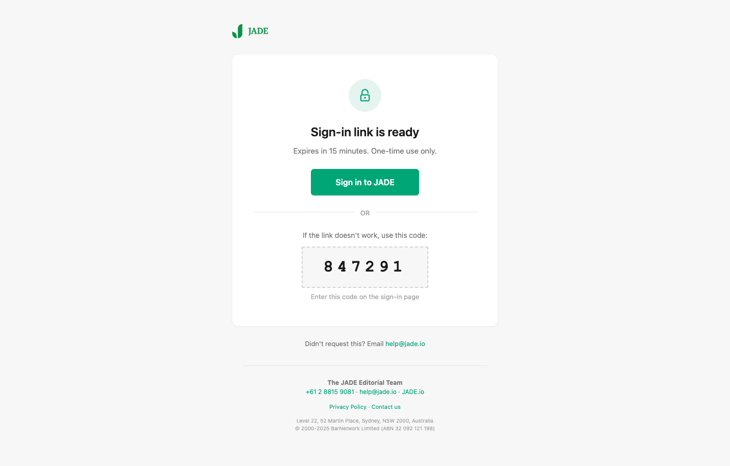
Passwordless Entry
Magic link authentication. Email entry only. No password friction.
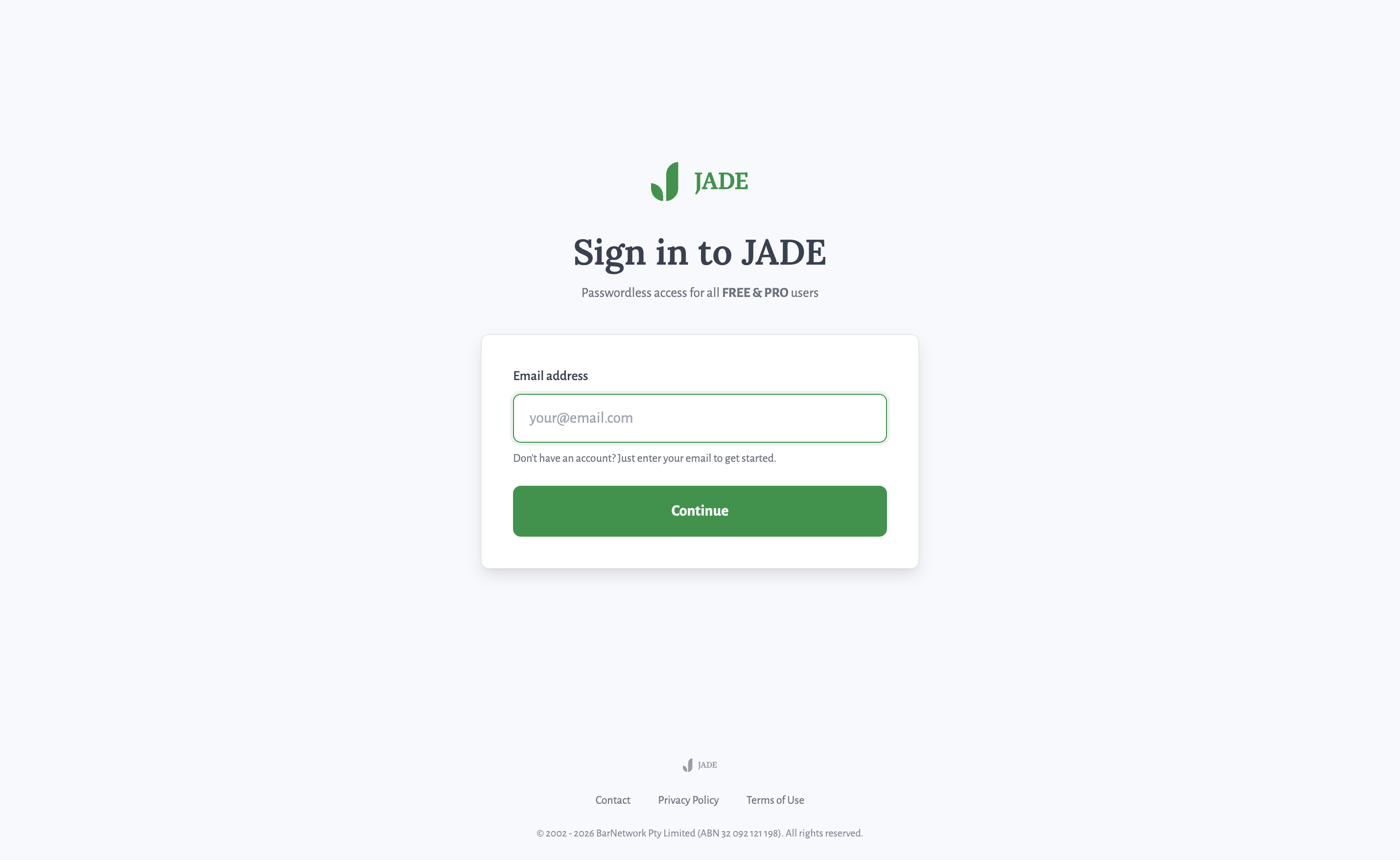
Passwordless sign-in: email-only entry point
Email Verification
Clear confirmation with visual feedback. Users know exactly what to do next: check email, click link.
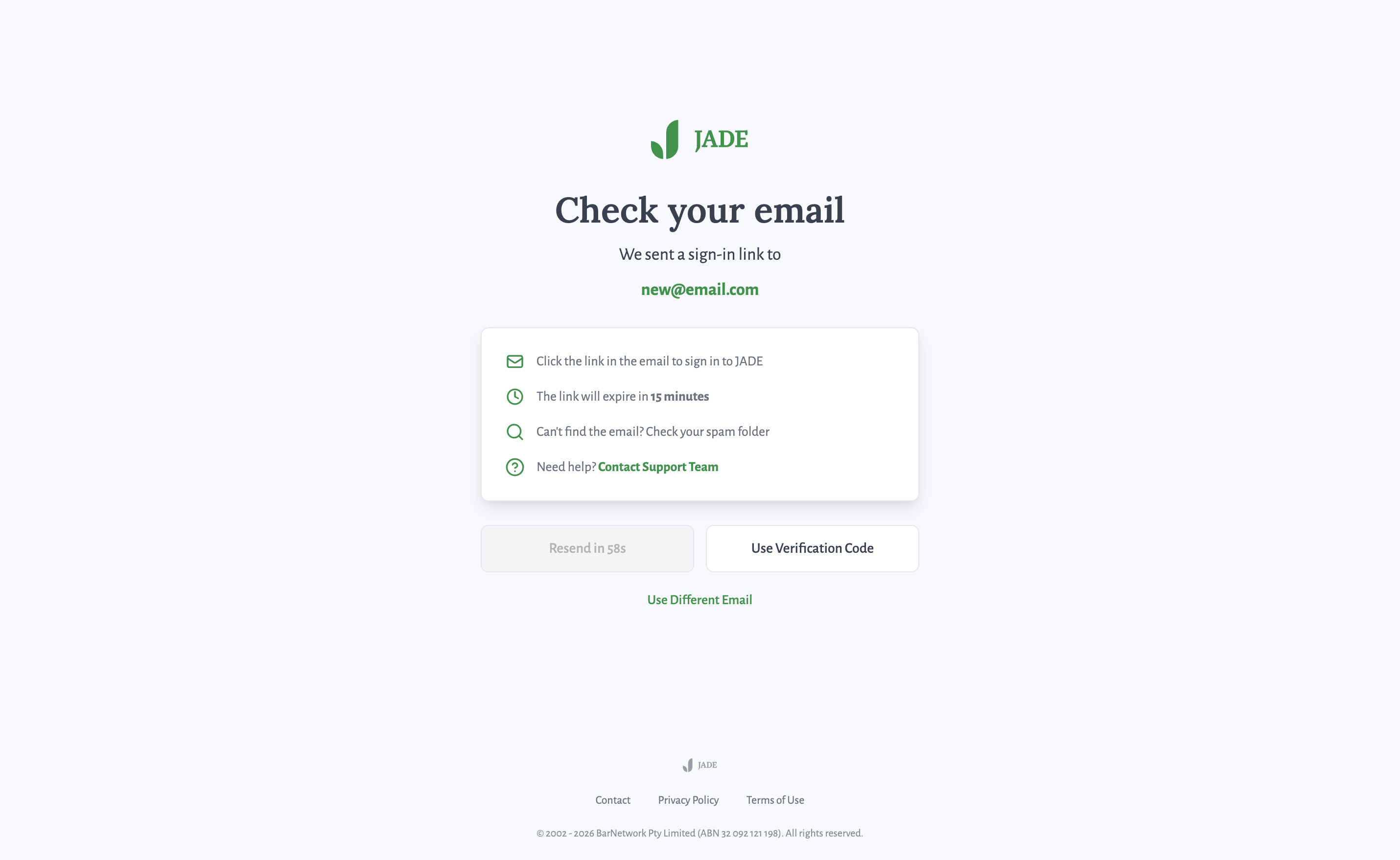
Verification pending: clear next-step guidance
Alert Preferences
Key MomentJurisdiction, courts, and topic filtering capture intent so JADE surfaces relevant judgments immediately.
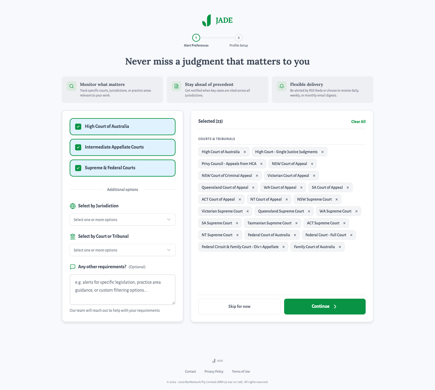
Intent capture: jurisdiction, courts, and topic filtering
Account Setup
Minimal fields. Progressive disclosure. More detail collected over time, not upfront.
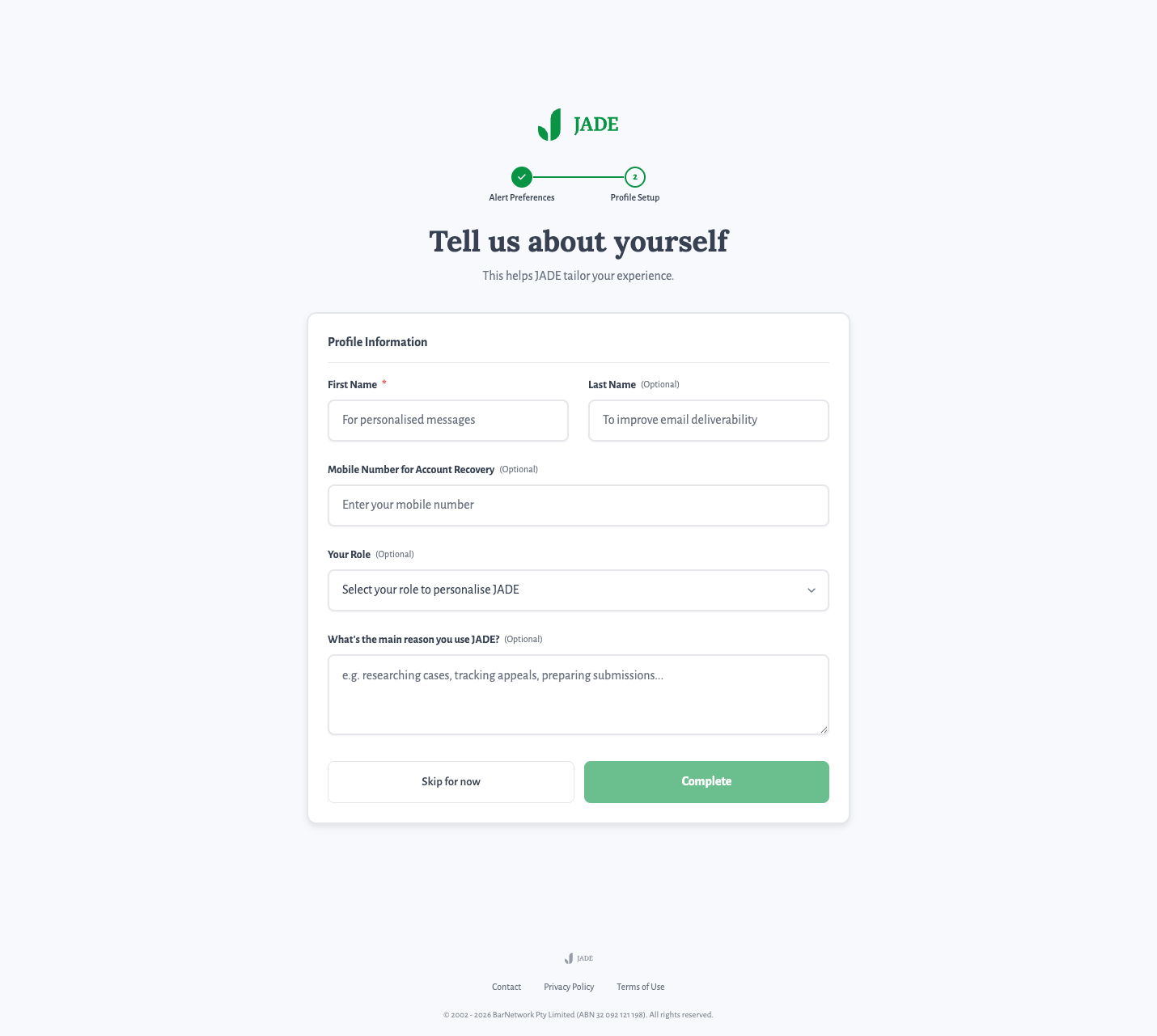
Profile setup: minimal fields, progressive disclosure
Plan Selection
Pricing comes after value delivery. Free tier provides genuine utility. Pro upgrade path is clear but not aggressive.
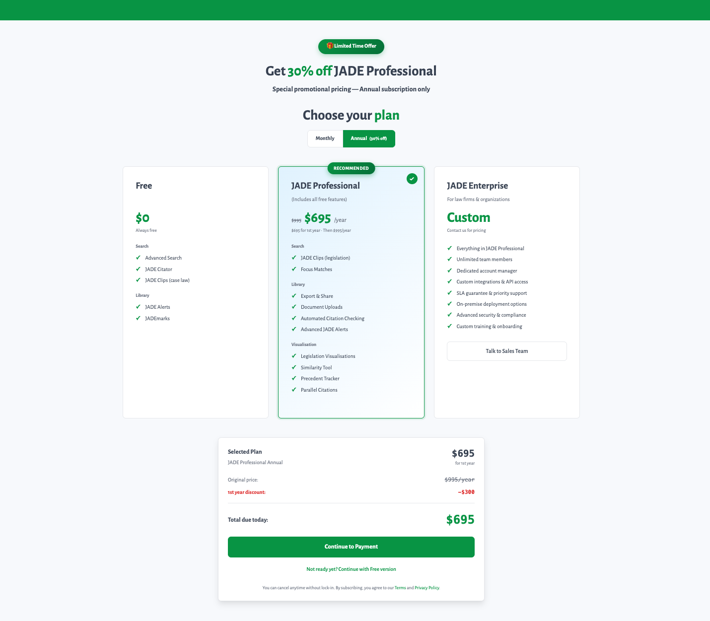
Plan selection: Free → Professional → Enterprise, shown after value is felt
Access Granted
Immediate access. The user is now inside the product. Value delivered, friction eliminated.
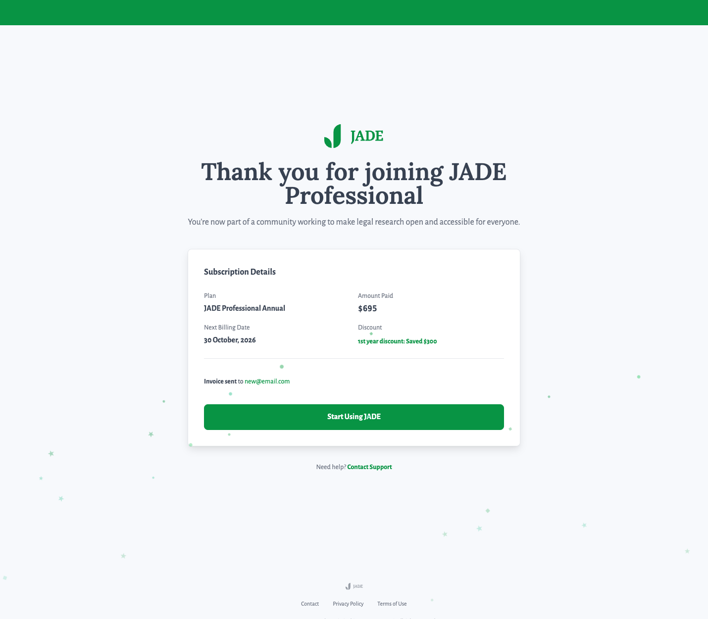
Subscription confirmation: immediate product access
Three Buyer Types, Three Paths
A sole barrister paying with a credit card and a top-tier law firm going through procurement are completely different conversion journeys. The old flow treated them identically. The redesign gave each a path that matched their actual purchasing process.
The Results
These numbers aren't from a better-looking form. They're from a system that captures intent, delivers value, and creates a reason to return. Within days of going live:
Attribution: No marketing campaign, pricing change, or external promotion occurred during the launch window. The primary variable was the redesigned subscription and payment flow.
What I owned. The activation architecture as a system: the end-to-end redesign from entry to paid access. Passwordless entry flow and magic-link verification. The three buyer-type paths (Individual, Firm, Institution) and the logic separating them. All copy across the activation surface. Front-end implementation of the signup, verification, account setup, plan selection, and payment flows, shipped to production myself.
What sat with others after handoff. Platform engineering, including auth infrastructure, billing integration, and backend session management, sat with the Open Law engineering team. Email delivery infrastructure and template-sending setup was a partnership with the marketing ops team; I designed and coded the templates, they handled the delivery layer. Post-launch analytics instrumentation was scoped and owned by the data team. Drawing this line matters because activation results compound across both layers, design and infrastructure, and I want it clear which layer I shipped.
Designed the system. Then shipped the code.
Full Activation Funnel
Entry → verification → plan selection → payment → intent capture → personalised activation.
Subscription Page Redesign
Authority positioning, edition differentiation, Free/Pro/Enterprise with clear upgrade paths.
Email Template System
Magic link verification, welcome, and promotional emails. Designed and built for cross-client compatibility (Outlook, Gmail, mobile clients).
Case Card Standardisation
Unified UI across Home, Browse, and My Reports with consistent IA.
Magic link verification email
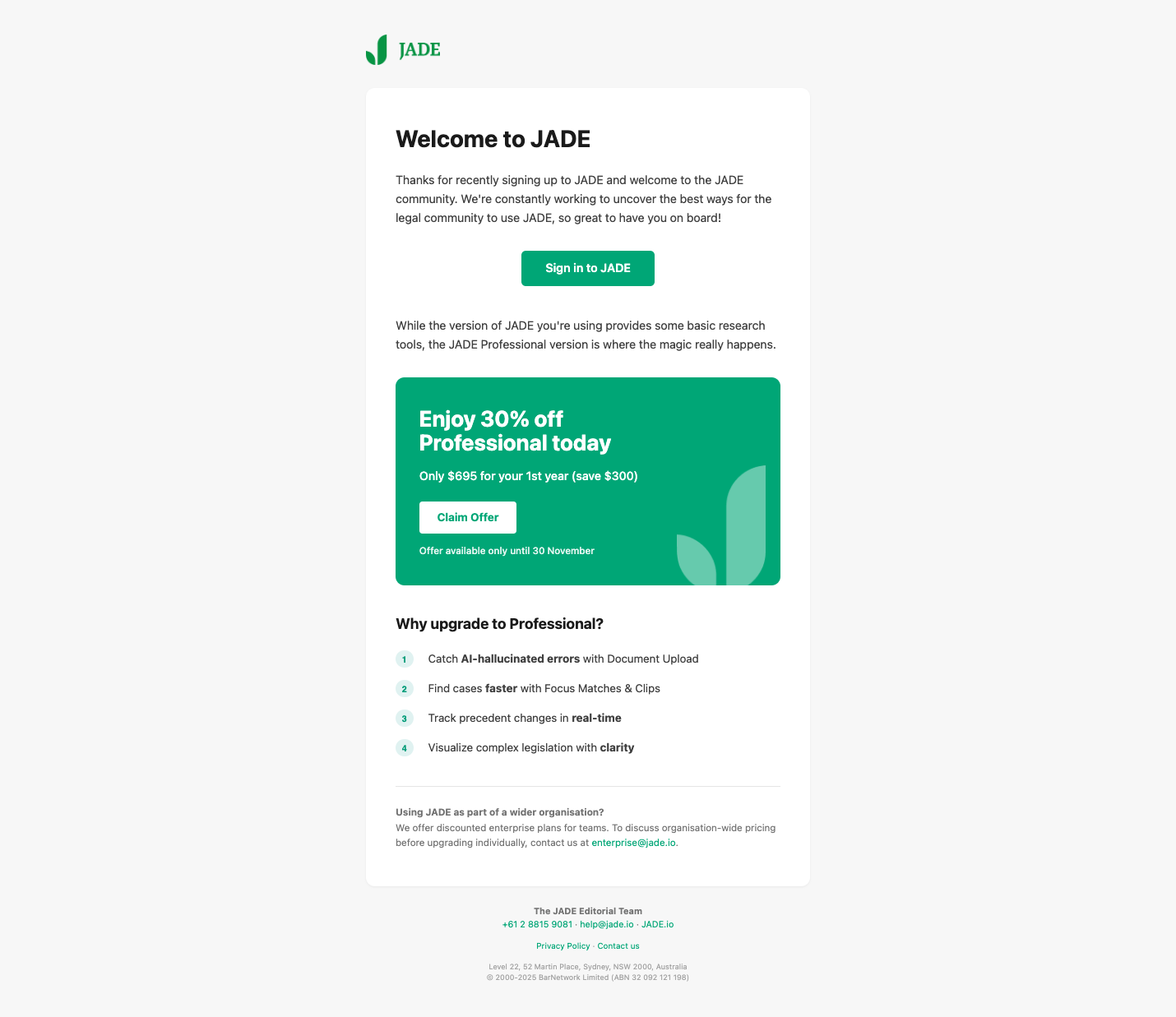
Welcome email with Professional upgrade path