
Live & shipped
A self-directed design task for Envato Elements, built end-to-end and deployed. Strategy, UX, art direction, and the front-end code are all mine. Click through the real responsive site, not a flat mockup.
Redesign the homepage for a marketplace becoming an AI creation platform.
The audience is visually fluent creators, people with high visual IQ who can tell crafted from generic in a glance. For them the homepage cannot just claim taste, it has to show it. The design itself is part of the argument: if the page looks like the same flat AI output everyone is already drowning in, the pitch is dead before the first scroll.
Envato Elements is becoming an AI creation platform, now up against a wave of pure-AI generators. The deeper problem sits one level above the product: generation got cheap, so the market filled with the same look. Everyone has the same prompt box and the same models, so everyone ships the same generic output. The homepage had to say, in the few seconds a visitor gives it, why Envato is the way out of that.
And it had to do that without throwing away Envato's real moat. The old homepage led like a stock marketplace, a wall of categories, but underneath sits the thing no pure-AI competitor has: a deep, searchable library of 28M+ human-crafted assets. The redesign had to chase the AI story and protect that strength at the same time, not trade one for the other.
Search is the superpower. Keep it in the hero, change what it searches.
A pure-AI tool hands you a prompt box and asks you to describe taste in words. Most people cannot, so the model returns the average and out comes the generic. Envato has the one thing those competitors do not: 28M+ human-crafted references and a search built to navigate them. That search is the moat, so the redesign keeps it exactly where Envato's strength belongs, in the hero, and changes what it does. Not search assets to download. Search taste to generate with.
"Stop describing taste. Start showing it."
You pick a few references and they become the instructions the AI generates against. The library and the AI stop being two products and become one loop, fed by the searchable human catalogue. That is the value no prompt-box competitor can copy, and it is carried the whole way down the page: the hero searches taste, the mechanism shows it, the tools generate in it, the human library proves it. One differentiator, landed end to end ("Escape the generic.").
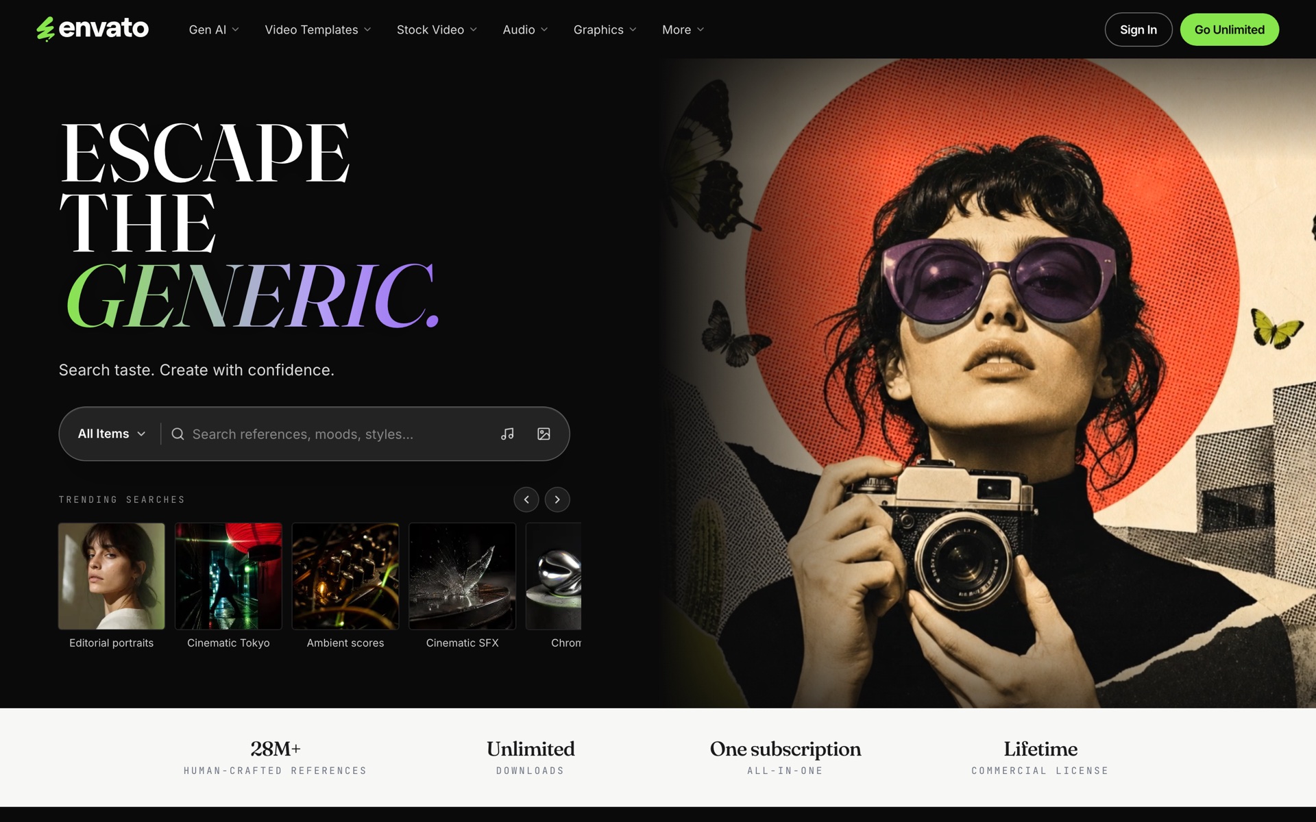
The redesigned homepage. Search stays in the hero, evolved from search assets to search taste, with the 28M+ human-crafted library sitting right under it as proof of the moat.
A decision board before a single pixel.
I did not start in Figma. I started with a problem, decision, and tradeoff board: what the page must do, what it can drop, and what a visitor will tolerate. That board produced two things that governed everything after it: an attention-budget funnel, and a deprioritized list (category routing, MCP banners, and feature tours all came off the hero on purpose).
Then I verified the facts before writing a word of copy. Real pricing tiers, the real model lineup behind each tool, the real asset count, and real campaign creators were all checked against Envato's own public pages. Nothing on the page is invented marketing. If a number could not be sourced, it did not ship.
One source wins per dimension. No blending.
With three inputs in play (a visual direction, verified research, and the existing brand), the fastest way to ship a mess is to average them. So I set a rule: for each kind of decision, exactly one source is authoritative, and it is never mixed with another inside the same dimension. It kept the redesign honest and made every "why is it this and not that" answerable.
Composition & Copy
Visual direction wins
Section order, layout, headlines, and CTA labels come from the design mockup, untouched by the other two.
Facts & Numbers
Verified research wins
Pricing, the model lineup per tool, and asset counts come from Envato's public pages, overriding any stale figure.
Identity
Existing brand wins
Real customer logos and brand tokens stay as they are, instead of the mockup's placeholder wordmarks.
Search taste. Create with confidence.
The mechanism has to close in one read, so it is one sentence and three steps. No tour, no modal, no "learn more" before the value is clear. By the final design it had been cut from four steps to three: every word that was not load-bearing came out.
Pick references
A few stills from the 28M+ library set the direction.
AI generates in your direction
Leading models read the references as instructions, not the average.
Refine and ship
Adjust, then download with a lifetime commercial licence.

References float into the generation surface. The animation on the live site makes the "your taste, in the loop" idea literal.
Every section earns a slot in a few seconds of attention.
The funnel from the decision board sets a budget. Each tier has one job, and any section that cannot pay for itself at its moment gets cut or moved. This is what kept the page from sprawling into a feature list.
Keep Envato's search, point it at taste.
Category routing is what a marketplace does: it tells the visitor to go find something. But search is Envato's actual strength, so the hero keeps it and sharpens it. One search field that reads references, moods, and styles, plus a row of trending searches that seed intent. The first interaction is taste, not navigation, and it runs on the one asset a prompt-box competitor cannot match. Categories stay deeper in the page for return visitors and SEO, an accepted tension I documented rather than hid.
The art carries the same message. An editorial collage in the Saul Bass and Sagmeister lineage, torn paper and halftone over a bold palette, is the opposite of the flat, sanitized AI-generated look the headline promises to escape.
Real work from real campaign creators.
The trust tier is a cinematic reel of actual campaign work, attributed to real creator handles pulled from Envato's own campaigns. No stock placeholders, no engagement-count theatre. Craft is the argument, so the work has to look like work.


Built on every leading model.
Instead of pretending the AI is one proprietary black box, the tools section is honest about the engines underneath: Seedance, Kling, Veo, Flux, and more, each tagged to the tool it powers. It reads as a filterable visual grid, so a visitor can pick the engine that fits the shot. Every model name on the card is one I verified is actually offered, not padded with fictional pairings.


Teach the workflow, do not just sell the tool.
Adoption is outrunning literacy: people are excited about AI but unsure how to use it well. A free tutorials row, taught by working creators, closes that gap and positions Envato as a guide, not just a vendor. It is a trust signal that also lowers the real barrier to a first generation.


Put the human library where it lands as the moat, not the intro.
The 28M+ human-crafted assets are the one thing an AI-only competitor cannot copy. So they come after the AI story, not before it. By that point the visitor understands the loop, and the library reads as the deep well that feeds it and the proof of craft behind the brand, framed as "one library" under the same subscription.
Designed through execution, AI on the tools, judgment on the calls.
This was not handed off. I art-directed and generated every piece of artwork through a CLI image pipeline, then built the site myself in Next.js, Tailwind, and shadcn and deployed it to Vercel. AI did the heavy lifting on production: image generation and code scaffolding. The judgment stayed human: the positioning, the composition, the copy, the source-of-truth calls, and what was good enough to ship.
It also iterated in public. The page went through three full versions, each one cutting more and committing harder to the thesis. The final version was promoted to the root route: search-led hero, a mechanism trimmed to three steps, and the model-agnostic tool grid. That loop, generate fast, then judge hard, is the whole working method.
A complete, live, responsive homepage. Strategy to code, solo.
Ten sections, desktop and mobile, shipped end-to-end from a self-directed brief. The thesis held all the way through: escape the generic by leading with taste, not a prompt box. The best way to read it is to use it.