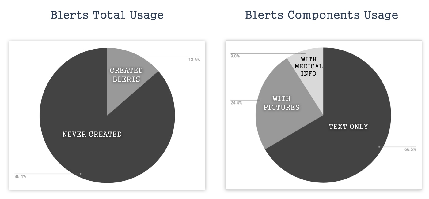
Our product team has started looking at key insights on how Blerts (the main feature for Blerter) are used by users so far. The data showed that 86.4% of the users are not using the Blert feature actively even though it was promoted in the app significantly. Also, 66.5% of the Blerts are created only with text and the rest of the components are hardly used. Feedback from a user interview backed up this analysis: "Using Blert to report & its response time in the system are slow".
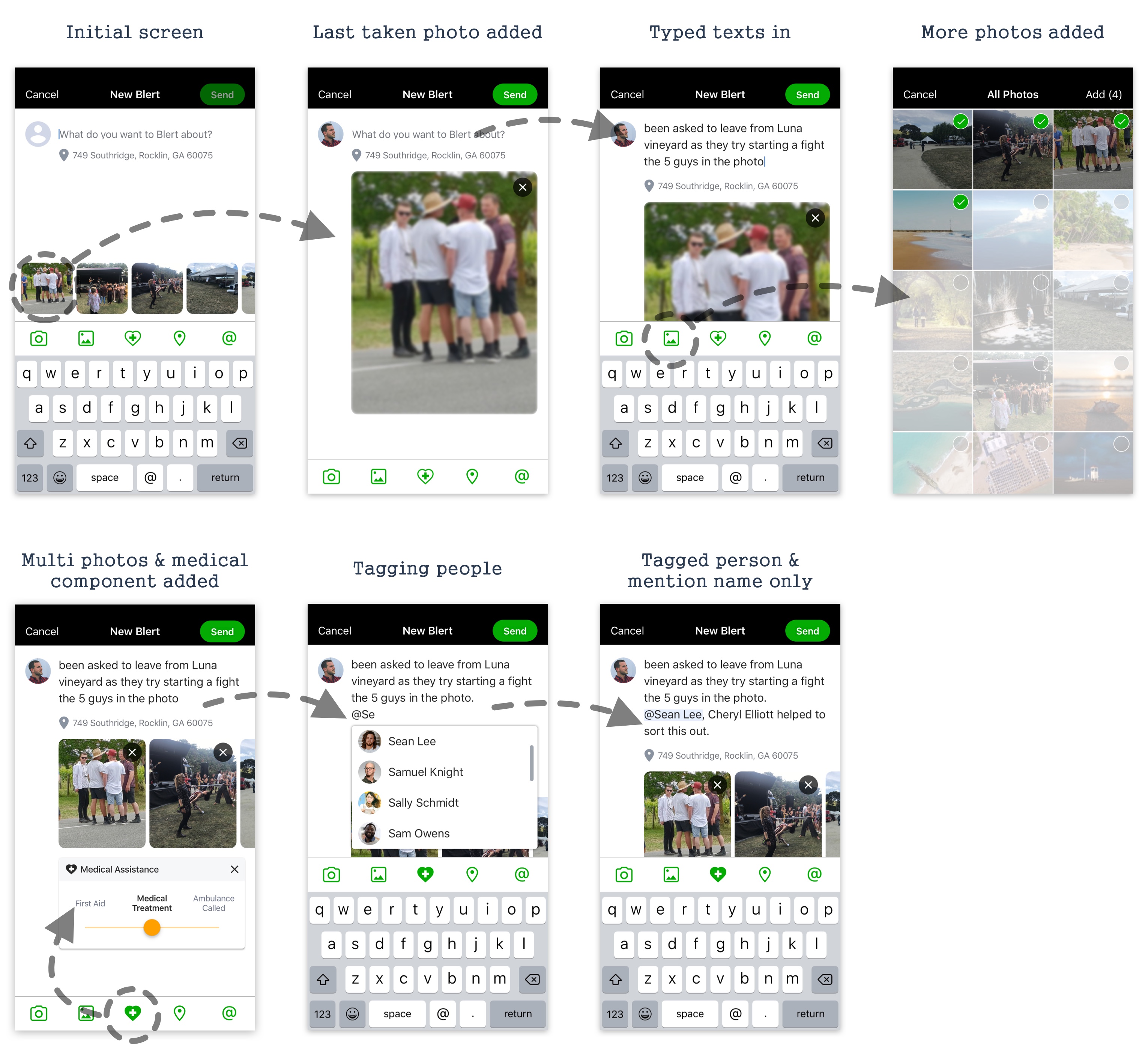
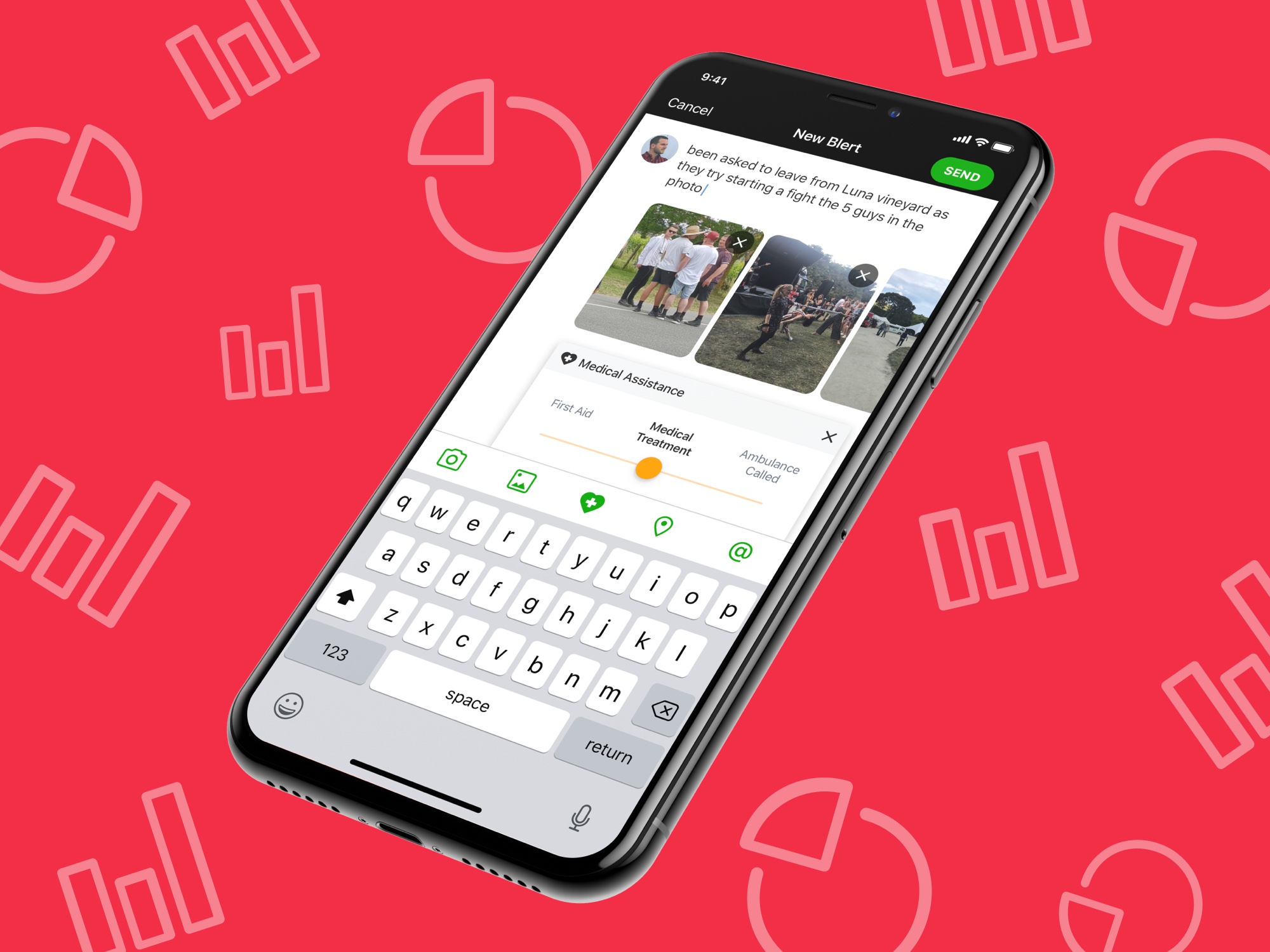
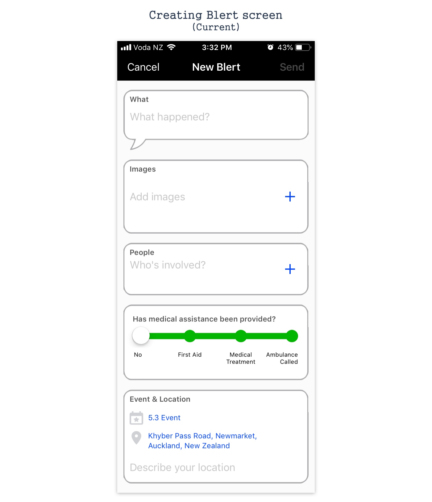
Current new Blert screen is unnecessarily showing all of the optional fields as default. This causes users to think that creating Blerts requires filling all those fields which will be tedious in a time-critical situation (usual in event scenes). Also, the UI does not look either native for any mobile platforms or customised to be aesthetically pleasing.
Posting component is not a very new idea these days. Many other products would have been improving it for their users. Therefore our team thought that we can learn from what other products are doing well. I have researched well-known products having the posting component as their main communication source like Blerter.
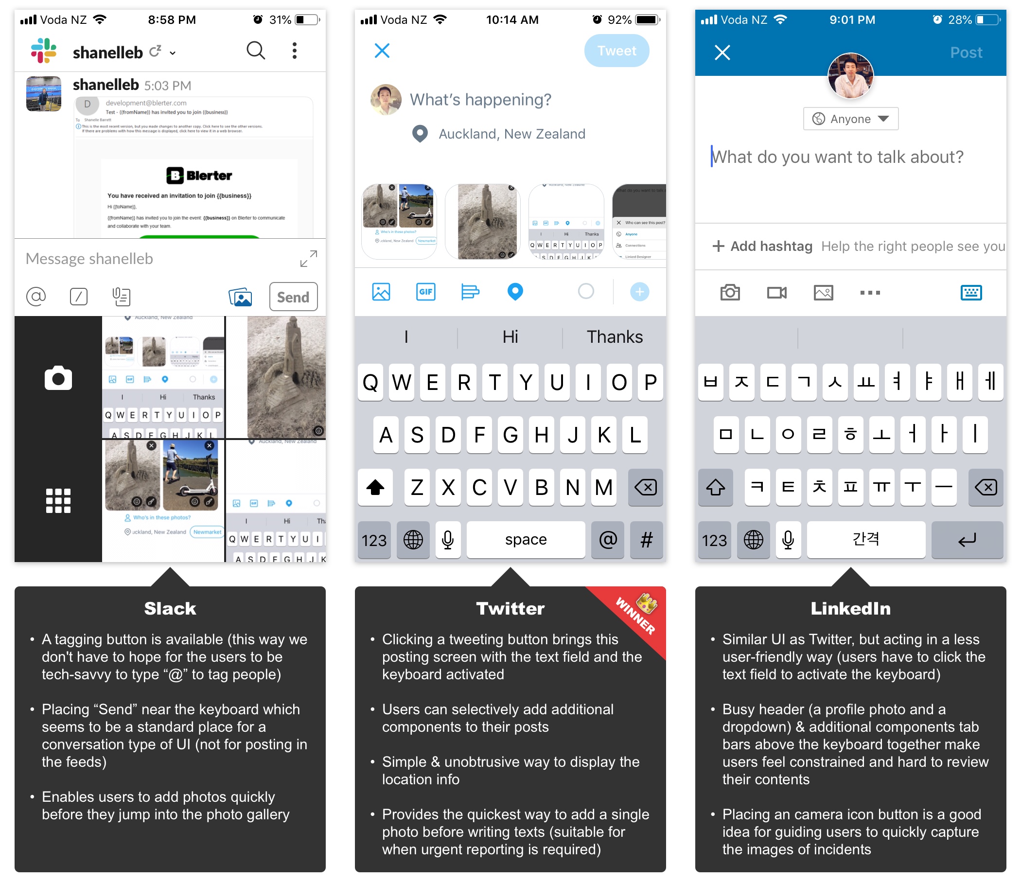
Our team concluded that using the Twitter option as a base UI, and bringing the Slack's tagging button and the Linkedin's camera icon on top of it would be the best option for Blerter regarding our users' working conditions (time-critical situations & the majority of the volunteers in events are old and non-tech savvy).