Blerter has pivoted from Health & Safety managing app to Event managing app. As a design lead in the Blerter team, I was required to take the lead in rebranding UI for web & mobile apps (new brand essence was provided by an agency). After the first cut of rebranding, me and other team members have carried out user interviews in order to understand current usability issues.
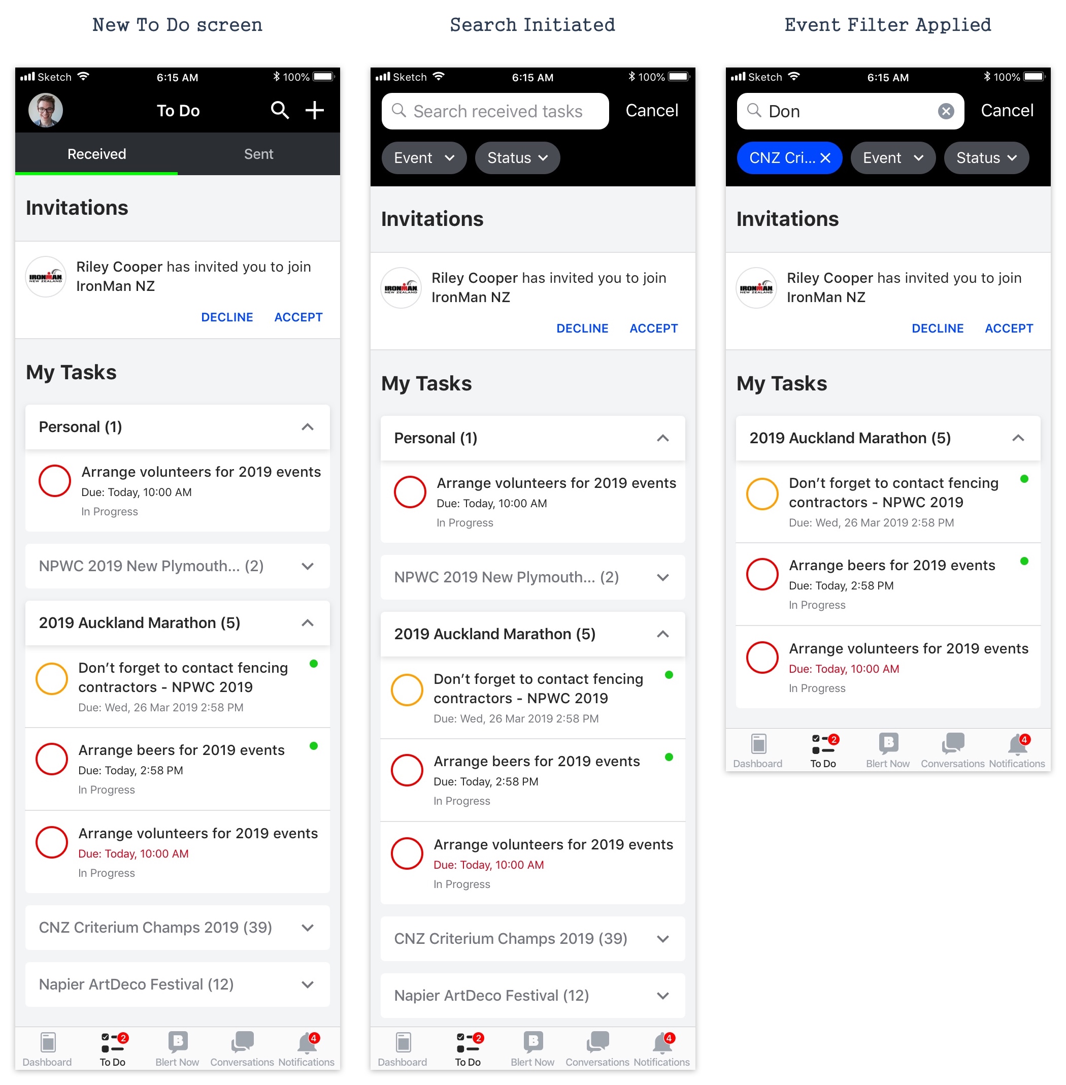
"To Do" functionality was initially designed to enable users to manage their own tasks effectively across all the events they have joined. All the tasks in To Do were sorted by the priorities, and this is problematic for the users as there is no way to pull out tasks for a specific event(s). This becomes a bigger problem on the actual event day as they do not want to get distracted by other event tasks. Another thing I could spot was that the current filter option is not accessible as it is placed on the left of the search bar and does not look actionable at all.
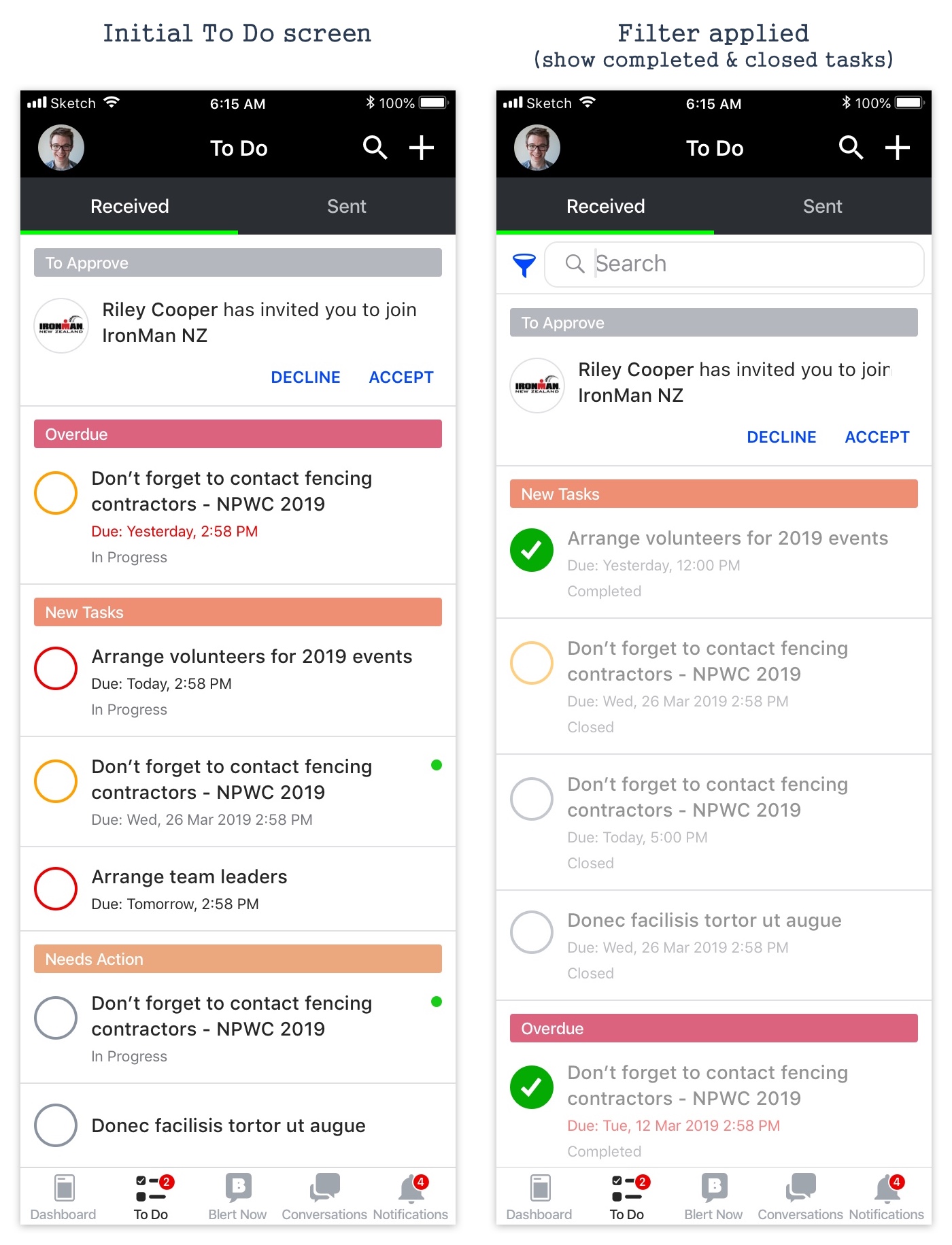
In the new UI, All tasks are sectioned by events & personal tasks. The section panels are displayed in the following order: from the top, Personal Tasks > Current event > Earliest Start Date > Latest Start Date > if no Start Date, alphabetical order. Instead of confusing users with the filter icon, filter options are shown when the search is initiated. Users can now search tasks by keywords, filter tasks by the events they are interested in and change the task status in one place.
Apart from solving the problems stated earlier, I have simplified the UI so that the colors of the task priorities now have more visual weight.